[DONE] Request for Trailers (1.13/1.14)
Moderator: Forum Moderators
Re: Request for Trailers (1.13/1.14)
I'm watching the video… isn't this turn-based tactics rather than strategy?Kasdel wrote: ↑April 27th, 2018, 3:07 pmThat... actually makes sense
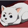
The portrait by itself doesn't really indicate "fireballs", but it gives off a more magical feel than the Mage of Light's.
Also... the trailer is finished! All that's left is to export and upload. I'll still be able to change it according to feedback, of course.
EDIT: It is here!
(The quality is not the best possible, but it will be on the definitive version of the trailer.)
Otherwise, wow, nice video. Oh, and I've seen the Red Mage is in, rather than the Mage of Light.
And, seriously, the graphics do a lot. I've convinced some RL people to play only after insisting that the chibi style of the graphics does not mean the game is easy or stupid or meant for children.
So including a few pics of highly-detailed illustrations such as the ones in the unit description entries can help draw people in (e.g., off the top of my head, Inferno Drake, higher-level Undead, perhaps the Merfolk magic-users, the Red Mage, etc.). It's just a second or two of screen time but it can be very effective.
I'm highly tempted to start advertising by posting the video as it is across several forums in which I have accounts with… well, quite larger postcounts and a longer presence than here.
Use a match that features all mainline factions? Or maybe two maps with a few in each?octalot wrote: ↑April 27th, 2018, 10:44 pmInstead of using a different match for each faction, you could take a match and show the name+portrait overlay of both factions.Kasdel wrote: ↑April 27th, 2018, 9:05 pm The faction showcase is actually the part of the trailer where the individual scenes last longer, I even thought they could be too long. If I extended their duration, the trailer would probably last too much time for the attention-span of many potential players who need to get to know as much of the game as possible in one and a half minutes. That's why a lot of scenes jump around quickly. I'll see what I can do to fix that.

Re: Request for Trailers (1.13/1.14)
I would like to suggest stating in the trailer that "continuous development and new features gives new reasons to continue playing or come back" or a similar phrase.
I would like to suggest adding quotations from positive reviews of the game. There is a wiki page on review of wesnoth but it might be outdated: http://wiki.wesnoth.org/Wesnothreviews
For example:
"For a free and open source game, Wesnoth is frighteningly well-maintained." - Rock,paper,shotgun https://www.rockpapershotgun.com/2014/1 ... ng-better/
Re: Request for Trailers (1.13/1.14)
Hi guys,
The Battle for Wesnoth is also available for android and ios, maybe you should add that to the trailer?
I know those are not official builds, but some of our players do play on those devices and since we have one server that is cross platform, it then adds to the player base , because many people have good phones, but bad computers
Re: Request for Trailers (1.13/1.14)
Oops I forgot the ios version is not free and android (one android version is free), so that might cause conflict, rather leave it out I guess

Re: Request for Trailers (1.13/1.14)
To clarify: the iOS version is official and its revenue supports the project’s operations (art commissions and server hosting mainly). Currently the iPhone build is far behind the iPad build though.
Author of the unofficial UtBS sequels Invasion from the Unknown and After the Storm.
-
beetlenaut

- Developer
- Posts: 2825
- Joined: December 8th, 2007, 3:21 am
- Location: Washington State
- Contact:
Re: Request for Trailers (1.13/1.14)
I hadn't watched this yet, and it's the best trailer we have had! I like what you did with the TRoW story art particularly. I saw a few issues though. I seem to be a little late to this party, though, so I'm not necessarily expecting you to change it. Some of them might take too much time anyway, but a couple would be easy:
1) All the text is a noun phrase in a similar format like hundreds of add-ons, challenging battles, many factions, etc., until you get to the end where you have "Create your own content." It's jarring. You should have, "Content creation system," or "Map editor and scripting language," or something like that.
2) Almost all the maps in the video look the same! You did show different times of day, but you used mostly multiplayer maps that have little blobs of terrain for balancing purposes. Campaigns have a huge variety of maps like mountains, deserts, snowfields, oceans, and caves, which look more natural and demonstrate the diversity of the game.
3) All the units at the beginning have a magenta team color. That color was chosen because it's not a color anyone would use. It's bright and pretty ugly. It should be replaced with a team color. (If you are using something like GIMP, you can just remove most of the blue from the magenta in the palette, and the magenta will look red, which would be good enough.)
4) I know there is only one dunefolk portrait available, but it looks wrong and unbalanced like that. There is really no need to show all the factions anyway, so I would just take them out and say, "And more..." on that screen. Then you could use any two other portraits that looked nice. (Merfolk and trolls are not represented yet.)
5) It would be better if you showed zoomed-in game play (at least some of the time). It's very hard to make out if the video is normal sized. Three zoom levels gives a smooth, nicely scaled look (the one that is used to show the units on the help screen).
I'm not just griping, I'd be willing to help if you want. If you do want to change the maps but don't have replays from campaigns, I can send some, and I can do team coloring and things.
@max_torch: There is always more you could say, but more reading makes a video worse. Sadaharu used a good level of text already.
Campaigns: Dead Water,
The Founding of Borstep,
Secrets of the Ancients,
and WML Guide
The Founding of Borstep,
Secrets of the Ancients,
and WML Guide

Re: Request for Trailers (1.13/1.14)
beetlenaut wrote: ↑April 29th, 2018, 5:50 pm
4) I know there is only one dunefolk portrait available, but it looks wrong and unbalanced like that. There is really no need to show all the factions anyway, so I would just take them out and say, "And more..." on that screen. Then you could use any two other portraits that looked nice. (Merfolk and trolls are not represented yet.)
This is one point I disagree with. Having just one portrait for the Dunefolk isn't horrible. It raises a little bit the viewer's curiosity: What's different about these guys? In a way it's more interesting to break the pattern at the end.
http://www.wesnoth.org/wiki/User:Sapient... "Looks like your skills saved us again. Uh, well at least, they saved Soarin's apple pie."

Re: Request for Trailers (1.13/1.14)
I can change it, but I feel like "Create your own content" makes that aspect of the game feel more approachable. "Map editor and scripting language" reads more like "stuff for programmers" than "hey, you can make your own Wesnoth content easily!". It would be more consistent, but I don't see a way to have the same impact without using a phrase like the one I used.beetlenaut wrote: ↑April 29th, 2018, 5:50 pm 1) All the text is a noun phrase in a similar format like hundreds of add-ons, challenging battles, many factions, etc., until you get to the end where you have "Create your own content." It's jarring. You should have, "Content creation system," or "Map editor and scripting language," or something like that.
My only gripe with this is that to show the factions battling against each other (and thus making less cuts during the faction showcase, like suggested previously) it would be better to use multiplayer footage; easy to have the best map size, faction match-ups, AI control, etc. - I already have new footage recorded already to use for the next revision of the trailer. Factions are mostly oriented at multiplayer, so showing campaign gameplay with them isn't the best way to present them, IMO. But it's totally true that campaign maps are a lot more aesthetic than MP ones.beetlenaut wrote: ↑April 29th, 2018, 5:50 pm 2) Almost all the maps in the video look the same! You did show different times of day, but you used mostly multiplayer maps that have little blobs of terrain for balancing purposes. Campaigns have a huge variety of maps like mountains, deserts, snowfields, oceans, and caves, which look more natural and demonstrate the diversity of the game.
The rest of the trailer doesn't give me many opportunities to include campaigns. I have recorded footage of the beginning of the first level of HttT, I can fit it in somewhere. I'll see if I can put in some more.
Poor magenta... I really like the color, actuallybeetlenaut wrote: ↑April 29th, 2018, 5:50 pm 3) All the units at the beginning have a magenta team color. That color was chosen because it's not a color anyone would use. It's bright and pretty ugly.
I get that it's not a color players will see in-game... if you're willing to help replace it, then sure, I'd appreciate the help
I feel like that would break the balance of the faction showcase, and the synching with the music. Merfolk and trolls aren't exactly factions, just parts of factions, so it wouldn't make sense to showcase them side-by-side with "Undead", "Loyalists", etc. I tried to use the "Many factions to master" bit to show a few portraits of unit races that wouldn't have the chance to shine in the showcase itself.beetlenaut wrote: ↑April 29th, 2018, 5:50 pm4) I know there is only one dunefolk portrait available, but it looks wrong and unbalanced like that. There is really no need to show all the factions anyway, so I would just take them out and say, "And more..." on that screen. Then you could use any two other portraits that looked nice. (Merfolk and trolls are not represented yet.)
As for the Dunefolk issue, I could use a portrait like this one next to the other, or an OoA portrait if I need to, but what Sapient says makes sense as well. And if we're showing the other factions, might as well have the Dunefolk too. "And more" would imply that not just one faction got left out.
All of the gameplay I used, save for one little scene at the beginning, is zoomed-in...beetlenaut wrote: ↑April 29th, 2018, 5:50 pm5) It would be better if you showed zoomed-in game play (at least some of the time). It's very hard to make out if the video is normal sized. Three zoom levels gives a smooth, nicely scaled look (the one that is used to show the units on the help screen).
Zooming it more would probably make it easier to see in small sizes, but less so in fullscreen; it would increase the disparity between the font size and unit size, and wouldn't correspond too accurately to what playing Wesnoth looks like.
----
Also, I like the idea of including positive reviews. I was digging around and saw that Kotaku included Wesnoth in an iPad Gift Guide in 2010. While they didn't exactly review it, they did say it had "a constant stream of new battles to wage" and "It's a little bit Advance Wars, a little bit Fire Emblem". Good enough to include?
Re: Request for Trailers (1.13/1.14)
Red would be a good choice since it's usually the player's faction's colour.Kasdel wrote: ↑April 29th, 2018, 6:53 pmPoor magenta... I really like the color, actuallybeetlenaut wrote: ↑April 29th, 2018, 5:50 pm 3) All the units at the beginning have a magenta team color. That color was chosen because it's not a color anyone would use. It's bright and pretty ugly.And it's iconically Wesnoth.
I get that it's not a color players will see in-game... if you're willing to help replace it, then sure, I'd appreciate the helpI'll PM you the files.
-
beetlenaut
- Developer
- Posts: 2825
- Joined: December 8th, 2007, 3:21 am
- Location: Washington State
- Contact:
Re: Request for Trailers (1.13/1.14)
I'm not sure that it is more approachable because the word "content" is awfully vague for someone who hasn't seen the game yet. "Map editor" is more approachable because we have seen maps in the trailer, and you have a video of it. Is something wrong with "Map editor" or "Map editor and other modding tools?" It makes a difference in polish for the video.
Okay, but up until the faction showcase section, there are five shots of game play, and only one is from a campaign.
It would be better to use something like the second scenarios of UtBS and NR (desert and cave) so the maps look very different.
To me too, but only because I mess with the images! Normal players never see it.
Oh, I see. I guess it depends a lot or your monitor and the video size.
It also says, "If you don't like what you have seen so far, you still might like the part we haven't shown you." And mysteries intrigue people. That's why "and more" is used in advertisements even when almost nothing is left out; it's more likely to get people to buy. Anyway, I think it kind of looks like you messed up if there's no other image there, but you can keep it that way if it doesn't bother you.
Campaigns: Dead Water,
The Founding of Borstep,
Secrets of the Ancients,
and WML Guide
The Founding of Borstep,
Secrets of the Ancients,
and WML Guide
-
mikeanthony
- Posts: 56
- Joined: July 31st, 2013, 8:48 pm
Re: Request for Trailers (1.13/1.14)
Loving this trailer!
Even if this doesn't change at all, it's already great, so any feedback is purely 'even better if' stuff...
Just a thought on the 'only one dunefolk' image, (just because, like beetlenaut, it did catch my eye slightly) -
why not take out the second image on some of the other factions? so it goes 2, then 1, then 2, then 1, etc...
maybe this is getting needlessly subjective, and there is so much gorgeous art to showcase, but it's already very full-on with the volume of stuff happening on-screen, I suspect that having one less portrait here or there wouldn't go too much amiss, and might make the final faction only having one stand out a bit less...
on that note, I would add, the other thing that ever-so-slightly caught my eye was the white-screen text-editor bit; I totally get the idea that we're making the point you can do some very low-level content creation, and that's perhaps a bit of a dog-whistle issue that will really appeal to some gamers, but it might lose the interest of some others. Suggest: given that you can hardly read any of the text in the brief second it is on-screen, why not broaden things out a bit? have a smaller text editor view, but alongside an art-editing clip and maybe even a sound-file edit (waveform view), to make the point clear that content creation doesn't just mean coding; it's art, it's sfx and music, it's all sorts - that might capture the imagination of a wider audience of potential modders than just the plaintext editor view?
Just a suggest, and again: this trailer is already fab!
Incidentally, I agree with bitron's comment about the unit show-off - it's brilliant! As a stand-alone monkeying about project sometime, anybody want to add something like that to the credits screen, so that as you are scrolling down you see all the little in-game units charging about doing animations down the sides? #UnsolicitedSuggestionsCreatingNeedlessWork
Really look forward to seeing the final thing!
-
Celtic_Minstrel

- Developer
- Posts: 2209
- Joined: August 3rd, 2012, 11:26 pm
- Location: Canada
- Contact:
Re: Request for Trailers (1.13/1.14)
The only thing I don't really like about it is showing a shot of editing WML in a text editor... I don't think that really belongs in a trailer.
Re: Request for Trailers (1.13/1.14)
Love it!
Can we use it in AppStore?
Can we use it in AppStore?
Re: Request for Trailers (1.13/1.14)
I'll replace the text editor, it does look a bit out-of-place.
 But it will be better to wait until it's finished, which will be tomorrow.
-------
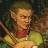
I'd like to know what are your opinions on using the portrait below alongside the current one for the Dunefolk. I think it's pretty much settled that they're getting a Roc, and there will probably be the need to reuse as many sprites and portraits as possible. The user Coffee pointed out in of of those Dunefolk discussion threads that their Arabian Nights era had a good quality roc portrait, so I looked for it and it's not bad. Not exactly in line with the mainline style, but it's usable.
Are there other UMC portraits that will probably be repurposed for the Dunefolk, or not really? Should I try to tinker with Kwandulin's Oath of Allegiance ones? Or leave it as it is? If I cut out the Dunefolk part and added the "and more" text, it would leave out a gap in the trailer that I don't know I'd be able to fill in in a satisfactory way, plus I already have gameplay with the Dunefolk alongside other factions, so I can't really prevent them from appearing... I feel like it would be better to leave them in. Any suggestions are welcome, and should be done quickly since the trailer will be finished tomorrow 
------------
So, an outlining of what I'll be doing in the next revision:
- Reworking the initial gameplay videos
- Reworking the faction showcase videos, including less cuts and more leveled-up units and animations
- Moving the faction names to the bottom
- Adding reviews
- Adding UtBS and NR footage somewhere, probably at the beginning
- Reworking the "create your own content part", the text, the map editor and the text editor videos
- Adding actual UMC gameplay to the "user-made add-ons" part
- Changing the Elvish Captain for another portrait
- Removing one of the story arts in the very last scene
And maybe more stuff I'm not recalling right now.
Stay tuned!
But that would make some factions seem more important than others...mikeanthony wrote: ↑April 29th, 2018, 9:59 pm why not take out the second image on some of the other factions? so it goes 2, then 1, then 2, then 1, etc...
maybe this is getting needlessly subjective, and there is so much gorgeous art to showcase, but it's already very full-on with the volume of stuff happening on-screen, I suspect that having one less portrait here or there wouldn't go too much amiss, and might make the final faction only having one stand out a bit less...
Sure, I'd be honored!
-------
I'd like to know what are your opinions on using the portrait below alongside the current one for the Dunefolk. I think it's pretty much settled that they're getting a Roc, and there will probably be the need to reuse as many sprites and portraits as possible. The user Coffee pointed out in of of those Dunefolk discussion threads that their Arabian Nights era had a good quality roc portrait, so I looked for it and it's not bad. Not exactly in line with the mainline style, but it's usable.
Spoiler:

------------
So, an outlining of what I'll be doing in the next revision:
- Reworking the initial gameplay videos
- Reworking the faction showcase videos, including less cuts and more leveled-up units and animations
- Moving the faction names to the bottom
- Adding reviews
- Adding UtBS and NR footage somewhere, probably at the beginning
- Reworking the "create your own content part", the text, the map editor and the text editor videos
- Adding actual UMC gameplay to the "user-made add-ons" part
- Changing the Elvish Captain for another portrait
- Removing one of the story arts in the very last scene
And maybe more stuff I'm not recalling right now.
Stay tuned!
-
Pentarctagon

- Project Manager
- Posts: 5564
- Joined: March 22nd, 2009, 10:50 pm
- Location: Earth (occasionally)
Re: Request for Trailers (1.13/1.14)
Using the Roc portrait wouldn't make a whole lot of sense, since the unit hasn't been added to the game yet.
99 little bugs in the code, 99 little bugs
take one down, patch it around
-2,147,483,648 little bugs in the code
take one down, patch it around
-2,147,483,648 little bugs in the code