Wesnoth Bestiary
Moderator: Forum Moderators

Re: Wesnoth Bestiary
The page has been updated again.
Give it a look and tell me what you think.
Thanks for the constructive criticism, kitty! Many of your comments where lingering thoughts I was unwilling to address yet.
Things to do:
Give it a look and tell me what you think.
Thanks for the constructive criticism, kitty! Many of your comments where lingering thoughts I was unwilling to address yet.
- I have addressed the margins so that they should all be the same. There is a gutter in the middle of the page, where the two meet. I’m thinking of keeping it that way. This page is still unfinished; there may be more stats and info to add in, and it’s very possible there may be text on both columns; the gutter will help with legibility.
- I am using italics as it is a description; flavor text that is not integral to the unit. Italics are used often in this regard and I feel this application is no different.
- I have set the spacing for all the columns so they should match up now.
- I have re-sized the resistance graphics smaller. Hopefully this is an improvement.
- I have added movement labels to the movement numbers. I am not entirely happy with this. I do agree with you that there needs to be some indication of what the values mean though I’d like to stay away from column headers if I can, to stay clean and keep consistent.
- I’m unsure about the kerning; it is showing up fine on my end. Must be browser specific. I have altered the font order, however, so Gentium does not automatically get used.
- Actually, part of the reason I chose the Dwarvish fighter is because he has two portraits. Yes, I’d like to provide a arrow or circles to click on that would show the other picture (and maybe randomly choose which one to show first).
- « is an experiment. I do feel the hyphen used in the game was placed in there arbitrarily. Personally I think it makes more sense having attacks then damage, but I do think it’s impossible changing the order now as it’s currently well-ingrained. However, I kind of like the double chevrons as they seem to point from the number of attacks to the amount of damage each deals. Don’t know. I can always change the character, though I was kind of curious how it would look.
- What the layout kinda looks like
- There is more information I want to add onto the page, though I’m not sure what. Suggestions?
- A full unit tree will be Phase #2.
- I still need to add in JavaScript to load different pages
- I still need to write a Perl file to extract text from the unit files.
Wesnoth Bestiary ( PREVIEW IT HERE )
Unit tree and stat browser
Canvas ( PREVIEW IT HERE )
Exp. map viewer
Unit tree and stat browser
Canvas ( PREVIEW IT HERE )
Exp. map viewer
Re: Wesnoth Bestiary
Looking good, I really like this project!
Two things come to mind:
1) don't use the « character, it is only confusing
2) I hope that everything will be clickable and show a group of units with that characteristic.
So that clicking the
- 'dwarf' in 'Race: dwarf' gets a list of all dwarves
- '8' in 'Attacks->hammer: 8-2' shows all units which have at least one attack with a base damage of 8 or clicking
- '20%' in 'Resistances->impact: 20%' shows all units that have 20% res to impact
/tsr

Re: Wesnoth Bestiary
Well, it's not everyday I get to give graphic designer critique.
The only problems I have so far are in the composition. Which is rather important seeing as the art is taken care of.
I can't shake off the nagging feeling that the margin around the edge is too narrow. Things like this are actually more important than people realize. If the margin is too narrow, then it's implying that (in artists terms) the composition is open, and that there are other things out of view off to the sides.
My suggestion is making it as wide as this gap or perhaps wider to avoid the even look.
(That's the big long one in the middle in case you didn't realize.
I would suggest making the resistances section bigger to fit in with the attack section above it. The font size is good, but the icons could be bigger. And it would take up some of the empty space underneath. Of course this might not be possible if your adding more information, but I just thought I'd tell you this anyhow.
The only problems I have so far are in the composition. Which is rather important seeing as the art is taken care of.
I can't shake off the nagging feeling that the margin around the edge is too narrow. Things like this are actually more important than people realize. If the margin is too narrow, then it's implying that (in artists terms) the composition is open, and that there are other things out of view off to the sides.
My suggestion is making it as wide as this gap or perhaps wider to avoid the even look.
- Picture 1.png (9.26 KiB) Viewed 4195 times
I would suggest making the resistances section bigger to fit in with the attack section above it. The font size is good, but the icons could be bigger. And it would take up some of the empty space underneath. Of course this might not be possible if your adding more information, but I just thought I'd tell you this anyhow.
My spritework can be seen here.
Want to play Roll 2 Dodge, or even start your own game?http://rolltododge.freeforums.org/index.php We need you!
Want to play Roll 2 Dodge, or even start your own game?http://rolltododge.freeforums.org/index.php We need you!

Re: Wesnoth Bestiary
Pretty nice. One of the things you could do, is use links enable the user to click on the unit sprites to access the page for any unit in the line.
Project Battlescar: An rpg engine of my own design.
http://battlescar.wikispaces.com/
http://battlescar.wikispaces.com/
Re: Wesnoth Bestiary
That’s definitely the plan!Zachron wrote:Pretty nice. One of the things you could do, is use links enable the user to click on the unit sprites to access the page for any unit in the line.
Wesnoth Bestiary ( PREVIEW IT HERE )
Unit tree and stat browser
Canvas ( PREVIEW IT HERE )
Exp. map viewer
Unit tree and stat browser
Canvas ( PREVIEW IT HERE )
Exp. map viewer
-
thespaceinvader

- Retired Art Director
- Posts: 8414
- Joined: August 25th, 2007, 10:12 am
- Location: Oxford, UK
- Contact:
Re: Wesnoth Bestiary
Looking very nice - don't forget, however, to leave room in the layout for larger-than-normal portraits (can go up to 500px square) and larger than normal sprites (no theoretical limit, though the fire dragon eternal is working on is going to be the biggest in mainline AFAIK).
I wonder whether it would be possible to animate units with standing animations... That would be awesome.
I wonder whether it would be possible to animate units with standing animations... That would be awesome.
http://thespaceinvader.co.uk | http://thespaceinvader.deviantart.com
Back to work. Current projects: Catching up on commits. Picking Meridia back up. Sprite animations, many and varied.
Back to work. Current projects: Catching up on commits. Picking Meridia back up. Sprite animations, many and varied.
Re: Wesnoth Bestiary
Well, both these points are easily taken care off, especially since the site seems to use jquery already.thespaceinvader wrote:Looking very nice - don't forget, however, to leave room in the layout for larger-than-normal portraits (can go up to 500px square) and larger than normal sprites (no theoretical limit, though the fire dragon eternal is working on is going to be the biggest in mainline AFAIK).
I wonder whether it would be possible to animate units with standing animations... That would be awesome.
a) for portraits you can define a max size (say 500px*500px) and all images below that size gets shown in 1:1 and the others get shown scaled down.
b) it is really easy to animate in jquery (especially since wesnoth doesn't use sprite-sheets)
Just throwing in some pointers cause I really want this to become good so that you can take care of the replay archive later (I started thinking about that, but gave up)
/tsr
-
thespaceinvader
- Retired Art Director
- Posts: 8414
- Joined: August 25th, 2007, 10:12 am
- Location: Oxford, UK
- Contact:
Re: Wesnoth Bestiary
Better woudl be to make the frame for th portraits the current maximum size (500x500) and let any smaller portraits sit centred within it horizontally, at the bottom vertically. Performing that sort of scaling on the fly is bad for the images 
http://thespaceinvader.co.uk | http://thespaceinvader.deviantart.com
Back to work. Current projects: Catching up on commits. Picking Meridia back up. Sprite animations, many and varied.
Back to work. Current projects: Catching up on commits. Picking Meridia back up. Sprite animations, many and varied.
Re: Wesnoth Bestiary
Yes, I wasn't very clear, but that was what I meant. That is you find the actual size of the image and if it is less than 500*500 you use that size but if it is larger you use the width and height attribute to scale it.thespaceinvader wrote:Better woudl be to make the frame for th portraits the current maximum size (500x500) and let any smaller portraits sit centred within it horizontally, at the bottom vertically. Performing that sort of scaling on the fly is bad for the images
/tsr

Re: Wesnoth Bestiary
I don't have much to say beyond nice idea! I look forward to seeing how it turns out.

Re: Wesnoth Bestiary
Much improved!
Tiny naggings:
* There isn't enough space between the defense percentage and the costs in brackets. And I have got a problem with the (1 move) notation - it isn't non-ambiguous, you need to mention that those are movement costs somewhere!
* You use the plural form in all headlines - so it should be Defenses.
* The « I don't have a better suggestion right now (some simple straight line like | or ¦ ?) but it's very confusing to me, between those two numbers it looks very much like an odd comparison operator to me. But if nobody else complains...
* For the two portrait question - do I understand you correctly that you are planning to show one set by default and you'll have some kind of arrow/button to show variants? For pure variants that's a fine solution, but for two gendered units it would be a shame to declare one of them the standart one and one only a variant...
-
Cloud
- Art Contributor
- Posts: 502
- Joined: December 17th, 2008, 7:43 pm
- Location: The land of pixels
- Contact:
Re: Wesnoth Bestiary
Very nice work, however I find it a bit strange that you're not using tables when this is one of the few places they're debatably better than divs. Also having images defined as backgrounds over the <img> tag, probably isn't the best for this solution, as the CSS file will have to have every single possibility held within it. For the weapons and resistances it's fine, but for the unit and portrait images, it's more than a little superfluous.
To show my bit about tables, with relatively little effort I was able to change it to this. There's very little difference (I added a background to the image out of personal preference, it doesn't have to be that way) just tables over divs for the stats (Actually your version does better in IE8 than mine, but I'll blame that on Microsoft being bad as my lecture always does, and I'm sure there's a fix for it if I actually wanted to find one).
Oh and thanks for showing me a bit more of what can be done with CSS, even if it doesn't pass the w3c validator.
Softly/SoftlySplinter on IRC. Will be lurking around more these days
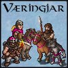
Mainline Animations|The Væringjar
Art for these mead-sodden, bearded mushroom-junkies by Girgistian!
Mainline Animations|The Væringjar
Art for these mead-sodden, bearded mushroom-junkies by Girgistian!
Re: Wesnoth Bestiary
Cloud, yours is actually very good. The only problem I can see is that the new writing and jive, has killed some of the neatness in the design. But, as you said you didn't put much effort into it, so it doesn't really matter.
My spritework can be seen here.
Want to play Roll 2 Dodge, or even start your own game?http://rolltododge.freeforums.org/index.php We need you!
Want to play Roll 2 Dodge, or even start your own game?http://rolltododge.freeforums.org/index.php We need you!
Re: Wesnoth Bestiary
Part of a good design is the code itself. Cloud, you do make a point in that strict, tabular data, a table is usually best for that presentation. However, I think you are wrong as far as the layout goes.
Tables are not optimal as they reinforce rigidity. They’re easy to make but not nearly as flexible. The idea is that the data on the page should be easy to be re-styled into radically different layouts.
Now why would that be important? Well, one of the things I plan on adding is a mobile version. It may not be practical having the data laid out anything like it is. Having one column may be a lot better, or perhaps only showing some content at one time, or even eliminating the portrait altogether, while the content flows back up, for example. Or a print version, something that scales the text to the width of the page, making certain sections bigger or smaller than others.
Wesnoth Bestiary ( PREVIEW IT HERE )
Unit tree and stat browser
Canvas ( PREVIEW IT HERE )
Exp. map viewer
Unit tree and stat browser
Canvas ( PREVIEW IT HERE )
Exp. map viewer
-
Cloud
- Art Contributor
- Posts: 502
- Joined: December 17th, 2008, 7:43 pm
- Location: The land of pixels
- Contact:
Re: Wesnoth Bestiary
Fair enough, I wasn't really advocating tables for layout (making websites totally out of tables is something I've done in the past, but I'm converted to divs to that sort of thing now I know how to correctly position them), but it's difficult not to deal with at least some of the layout when you go to tables. I got to muck around with another website, which is always fun.
For personal interest - any idea how the unit files are going to be parsed in? I'm guessing a system link the current unit's database is something you'd be looking for, I'd find it quite interesting to see how it's done.
For personal interest - any idea how the unit files are going to be parsed in? I'm guessing a system link the current unit's database is something you'd be looking for, I'd find it quite interesting to see how it's done.
Softly/SoftlySplinter on IRC. Will be lurking around more these days
Mainline Animations|The Væringjar
Art for these mead-sodden, bearded mushroom-junkies by Girgistian!
Mainline Animations|The Væringjar
Art for these mead-sodden, bearded mushroom-junkies by Girgistian!