Image tweak request
Moderator: Forum Moderators
Forum rules
Before posting critique in this forum, you must read the following thread:
Before posting critique in this forum, you must read the following thread:
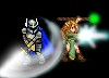
Image tweak request
Some time ago I had Valkier do a few images for me. They were great images and all, but one thing about one kept scratching at my mind.
This image. And that face.
For some reason, the more time passed the more it bothered me.
So I was wandering if anyone would like to give a shot at tweaking the head. My own attempts did not yield much fruit.
This image. And that face.
For some reason, the more time passed the more it bothered me.
So I was wandering if anyone would like to give a shot at tweaking the head. My own attempts did not yield much fruit.
- Attachments
-
- GSorceress.png (130.64 KiB) Viewed 2338 times
Light travels much faster than sound, that's why some people seem bright until you hear them speak.
>>> MY LITTLE LAB! <<<
>>> MY LITTLE LAB! <<<
Re: Image tweak request
Seems like a rather well-drawn picture, the style is controlled and clean, overall I think the picture is better work than for an example what I can do on a general level.
Did you ask/talk with Valkier about this?
I think it might be disrespectful to just modify someone else's work without consideration for how they might feel about it.
I think what probably bothers you about this picture is this:
* The charater in the picture has somewhat androgynous facial features, the chin is a bit boxy, eyebrows are flat, the nose is pretty robust, and the skintones towards the jawbone go towards gray color in a manner which somewhat hints at the presence of facial hair. And also the dark color underneath the eyes is somewhat intense, which makes the eyes seem a bit deeper in their sockets and also takes away from the contrast of the upperlids making the potential presence of eyelashes seem less prominent.
-> Looking just at the facial features it would be difficult to ascertain which gender the character is.
I think it's understandable if you want to change that. But that's not really critcism towards the artwork, but rather an observation of the character's qualities that have been drawn.
So it's more about whether you like the character in question than the technique it was drawn with. I think the technique seems good.
Does this assumption of what you want to change seem correct?
Re: Image tweak request
I hope this doesn't offend Valkier, but I went ahead to create a slightly more effeminate version of the image, if this is what Trashman was bugged about... Also included an intermediate step in the process of editing (and the original image) to this comment. In the process though the head become slightly too small in proportion to the body (while making the lower part of the face a bit smaller in relation to the head), so would still need to increase the size of the head very slightly.... Which I decided to do also. And by the way after examining the image a bit more closely, the 'grayer' color was actually green light reflecting from the dress... And increasing the size of the head caused the image to lose some sharpness
- Attachments
-
- The original image
- GSorceress.png (130.64 KiB) Viewed 2224 times
-
- Shape of the cheeks and the tip of the jaw was slightly adjusted, women have slightly rounder cheeks with larger fat deposits in them, while men have narrower cheeks, flat eyebrows were changed to thinner eyebrows which were slightly elevated, the intensity of the darkness under the eyes was slightly reduced, the upper eyelid was slightly darkened to increase the presence of eyelashes, the shadows around the nose were lightened to make the nose less prominent, the lower part of the nose was narrowed down a bit (men have wider noses), the shadow between the eyes was reduced, this increased shadow indicates the presence of the boss ridge, bone formation above the eyes which is prominent in men but women mostly dont have that Eyesockets were made slightly lighter
- GSorceress2.png (136.1 KiB) Viewed 2224 times
-
- The lowerside of the face was slightly shrunk, easiest way to do that was to tilt the head forwards while shrinking the lower part. Also the slant of the forehead was slightly changed, the shadows around the jaw and nose were further lightened, and also the cheek shading was improved a bit (it was a bit stale in the modification 2). Oh and in the process also changed the size of the mouth a bit and dissolved some of the black tracing around the mouth and changed the angle by a couple of degrees
- GSorceress3.png (126.23 KiB) Viewed 2224 times
-
- Headsize increased, and the hair was adjusted (not that there was anything wrong with it prior, on the contrary, but had to adjust it to the changes..) But this also caused the image to lose some sharpness and now it still seems a bit out of place (maybe I increased it a bit too much?) anyway the primary difference between this and image3 is the size of the head so both are valid. Perhaps I increased it a bit too much..
- GSorceress4.png (127.25 KiB) Viewed 2224 times
Re: Image tweak request
Nice.. I must say, your 1st step look the best, the 2nd and 3rd have a ... babyface effect
Light travels much faster than sound, that's why some people seem bright until you hear them speak.
>>> MY LITTLE LAB! <<<
>>> MY LITTLE LAB! <<<