Art by z5x1
Moderator: Forum Moderators
Forum rules
Before posting critique in this forum, you must read the following thread:
Before posting critique in this forum, you must read the following thread:
-
Implementor37

- Posts: 121
- Joined: February 22nd, 2015, 12:41 am
- Location: The Internet
Re: Art by z5x1
Wow. These are REALLY good. the 'apostate' is one of my favorites (Hope you finish animating all of them soon--they look really good), as is your drawing for his advancement. However, it really looks like there should be an advancement choice for this unit: I would give him the option of his current advancement (visible in Inferno.png) and the greenish-Assassin line in (Army Marmo.png). They are so similar (in an awesome, menancing way) that it seems as though these two should be related.
Are any of these units (with or without animations) available in a UMC add-on yet? They look so amazing I want to pulverize someone with them!
Are any of these units (with or without animations) available in a UMC add-on yet? They look so amazing I want to pulverize someone with them!
Author of End of the Legion, available now on the 1.12 and 1.13 servers!
Supporter of the addition of the Aragwaithi into mainline.
Supporter of the addition of the Aragwaithi into mainline.

Re: Art by z5x1
Thank UImplementor37 wrote:Wow. These are REALLY good. the 'apostate' is one of my favorites (Hope you finish animating all of them soon--they look really good), as is your drawing for his advancement. However, it really looks like there should be an advancement choice for this unit: I would give him the option of his current advancement (visible in Inferno.png) and the greenish-Assassin line in (Army Marmo.png). They are so similar (in an awesome, menancing way) that it seems as though these two should be related.
Are any of these units (with or without animations) available in a UMC add-on yet? They look so amazing I want to pulverize someone with them!
I do not know when I finish line of the apostate. But I'll try faster )
Yes, the killer looks like a apostate they will look like the description. Only apostates have magical abilities
Now this unit is not in the addon. I think it goes along with my era

Re: Art by z5x1
Those are pretty coolz5x1 wrote:finally completed yet apostate line
Re: Art by z5x1
Thank 
Yes, they are far mystical attack
Yes, they are far mystical attack
Re: Art by z5x1
Updated and added some units of the ruler of the empire Marmo
- Attachments
-
- хх.png (22.21 KiB) Viewed 6070 times
Re: Art by z5x1
After a long break, I started to draw again
- Attachments
-
-
- xx.png (15.63 KiB) Viewed 5941 times
-
Midnight_Carnival

- Posts: 836
- Joined: September 6th, 2008, 11:08 am
- Location: On the beach at sunset, gathering coral
Re: Art by z5x1
Glad you did.
I like your sprites, you have a distinct style and they go together well.
For the most part I have nothing to suggest, but there is one sprite I think you should look at agian.
At the bottom of your post you have images of humans with shields, swords and polearms.
The guy in armor with a shield and a spear looks great, but I have a slight issue with his weapon.
The way you've drawn it, you have the shaft extending down below his feet. This looks a little odd because of the way in which he's standing with his weapon arm furthest from the point of view. The only way I could see his weapon ending there would be if he held it at an angle, if he had his arm 'off to the side' (in front, covering his body) or if it extended into the ground or off a cliff
Other sprites you've drawn have their weapons ending level with feet.
That small technical issue asside, I think you've done a great job.
I like your infernal type guys.
...apparenly we can't go with it or something.
Re: Art by z5x1
1) Thank you, I'm glad you like my work
2) Yes, you're right, the spear in the wrong position, adding to the game, I will fix it
2) Yes, you're right, the spear in the wrong position, adding to the game, I will fix it
-
Nikita_Sadkov
- Posts: 67
- Joined: August 9th, 2015, 5:55 am
Re: Art by z5x1
The devils look homm3 inspired Otherwise nice works.
Re: Art by z5x1
hey I like the idea of northern unitsz5x1 wrote:And a little work on the northerners
Re: Art by z5x1
My new faction . This will add two more line units
- Attachments
-
- black Company.png (20.07 KiB) Viewed 5369 times
Re: Art by z5x1
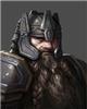
My first portrait for the new faction
- Attachments
-
- spearman.png (91.49 KiB) Viewed 5168 times

Re: Art by z5x1
Hi z5x1,
Not bad. Two things that I think would help are:
1. Draw at a larger size (like 800x800 px or larger), then shrink it down. That helps avoid the jagged outline (and accidentally chunky shading in general). It will also give you room to vary the outline thickness.
2. Make his armor less form-fitting. For example, don't have the outer curve of the shoulder-piece line up with the shirt under it at his triceps.
What is happening with his right hand?
Not bad.
1. Draw at a larger size (like 800x800 px or larger), then shrink it down. That helps avoid the jagged outline (and accidentally chunky shading in general). It will also give you room to vary the outline thickness.
2. Make his armor less form-fitting. For example, don't have the outer curve of the shoulder-piece line up with the shirt under it at his triceps.
What is happening with his right hand?
BfW 1.12 supported, but active development only for BfW 1.13/1.14: Bad Moon Rising | Trinity | Archaic Era |
| Abandoned: Tales of the Setting Sun
GitHub link for these projects
| Abandoned: Tales of the Setting Sun
GitHub link for these projects