Unit sprites for After the Storm
Moderator: Forum Moderators
Forum rules
Before posting critique in this forum, you must read the following thread:
Before posting critique in this forum, you must read the following thread:
-
artisticdude

- Moderator Emeritus
- Posts: 2424
- Joined: December 15th, 2009, 12:37 pm
- Location: Somewhere in the middle of everything
Re: Unit sprites for After the Storm
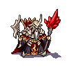
Curse that decidedly ambiguous Wesnoth perspective... still not happy with the Zephyr's wings, but until I can come up with a better fix here's my best result so far. Also, I don't know what that little demon up at the top is doing there, as he has no place in the ATS demon lineup, but I'm including him just because. Critique welcome, especially on the perspective of those wings.
More to follow.
More to follow.
- Attachments
-
- demons.png (28.95 KiB) Viewed 4717 times
"I'm never wrong. One time I thought I was wrong, but I was mistaken."
Re: Unit sprites for After the Storm
Woahhh I love those wings. Only nitpick is that the flame seems to blend with the wings a little too much.
Creator of Shadows of Deception (for 1.12) and co-creator of the Era of Chaos (for 1.12/1.13).
SurvivalXtreme rocks!!!
What happens when you get scared half to death...twice?
SurvivalXtreme rocks!!!
What happens when you get scared half to death...twice?

Re: Unit sprites for After the Storm
I really think that kind of effect belongs in a separate halo (possibly animated) rather than the baseframe itself, but that might be mostly because that used to be Jetrel’s opinion too; it has been a really long time, and I don’t know whether mainline conventions have changed in that regard. But most importantly, it is really kind of lost on the wing texture because of the similar colors.
The right (our left) wing also seems reminiscent of a pod because of the shadows on its lower right.
As for the rest, I think I’ll consult my size reference sheet first. One thing that stands out right now is the L3’s axe, which seems a little too smoothly shaded. It might be just me, though. Overall, everyone looks cool, although there’s something about their heads that bothers me, and I cannot quite put my finger on it.
Author of the unofficial UtBS sequels Invasion from the Unknown and After the Storm.

Re: Unit sprites for After the Storm
In terms of the heads being off, it's more than likely the horns and hairline that is making things look wrong. If the sprite were looking right at you they'd be off kilter. To solve the wing issue you could easily make a maquette to get the shapes down.

Re: Unit sprites for After the Storm
If the fire is on a separate halo image, you can tweak the sprite later without having to propagate the changes across multiple frames, assuming the flame is animated. So it is probably a good idea to leave the flame out of the sprite image.shadowmaster wrote:I really think that kind of effect belongs in a separate halo (possibly animated) rather than the baseframe itself, but that might be mostly because that used to be Jetrel’s opinion too; it has been a really long time, and I don’t know whether mainline conventions have changed in that regard. But most importantly, it is really kind of lost on the wing texture because of the similar colors.
BfW 1.12 supported, but active development only for BfW 1.13/1.14: Bad Moon Rising | Trinity | Archaic Era |
| Abandoned: Tales of the Setting Sun
GitHub link for these projects
| Abandoned: Tales of the Setting Sun
GitHub link for these projects
Re: Unit sprites for After the Storm
I like the new sprites but I think that they could be slightly enhanced. I understand that in the second and third row male and female variants are shown? If yes than the supposed females could have slightly narrower shoulders and much narrower waist area. Slight alteration of hair style could be useful too.
The sprite in forth row could have his left wing showing more of it's inside side. It doesn't match shoulders and hips position.
The sprite in forth row could have his left wing showing more of it's inside side. It doesn't match shoulders and hips position.
-
artisticdude
- Moderator Emeritus
- Posts: 2424
- Joined: December 15th, 2009, 12:37 pm
- Location: Somewhere in the middle of everything
Re: Unit sprites for After the Storm
Hmm. I'm ignorant of the official policy there, but it would definitely make sense to make it a halo (it would also let me experiment with the lighting effect on the sprite without having to directly edit the sprite itself). I have the flames on a separate layer anyway, so that should be easy to do.shadowmaster wrote:I really think that kind of effect belongs in a separate halo (possibly animated) rather than the baseframe itself, but that might be mostly because that used to be Jetrel’s opinion too; it has been a really long time, and I don’t know whether mainline conventions have changed in that regard. But most importantly, it is really kind of lost on the wing texture because of the similar colors.
I'm not terribly happy with the axe blade either, to be honest. I'll have another go at it and see what happens. With regard to the heads, is it the heads themselves or their positions on/relationships to the bodies?shadowmaster wrote:One thing that stands out right now is the L3’s axe, which seems a little too smoothly shaded. It might be just me, though. Overall, everyone looks cool, although there’s something about their heads that bothers me, and I cannot quite put my finger on it.
Thanks, those are very helpful suggestions!Mefisto wrote:I like the new sprites but I think that they could be slightly enhanced. I understand that in the second and third row male and female variants are shown? If yes than the supposed females could have slightly narrower shoulders and much narrower waist area. Slight alteration of hair style could be useful too.
The sprite in forth row could have his left wing showing more of it's inside side. It doesn't match shoulders and hips position.
Here's a height comparison. That little doodle-demon actually fits the canonical lvl 1 size better than the actual lvl1 demon, but I'm still going on the assumption that demons are built larger than humans.
- Attachments
-
- height_comp.png (17.74 KiB) Viewed 4579 times
"I'm never wrong. One time I thought I was wrong, but I was mistaken."
-
homunculus

- Posts: 537
- Joined: July 21st, 2010, 9:47 pm
Re: Unit sprites for After the Storm
you probably need more heavy metal style boobs on the females.
http://i11.piczo.com/view/i/5/341/69441 ... 7656_1.jpg
edit:
better geometry as far as i can tell, previously the left wing was way too large. actually it still looks larger, perhaps i don't see the curve in the right wing.
and are those wings supposed to be feathered wings at all? in the original sprites they look like drake wings.
edit2:
looks like there the drakes even have similar digitigrade legs, and the armor looks nice, just the drake would need to be flipped and a demon head pasted on top. the shoulders are too broad, though, that might need some adjustments.
[/i] 
http://i11.piczo.com/view/i/5/341/69441 ... 7656_1.jpg
- file.png (4.2 KiB) Viewed 4566 times
better geometry as far as i can tell, previously the left wing was way too large. actually it still looks larger, perhaps i don't see the curve in the right wing.
- file.png (4.17 KiB) Viewed 4531 times
edit2:
looks like there the drakes even have similar digitigrade legs, and the armor looks nice, just the drake would need to be flipped and a demon head pasted on top. the shoulders are too broad, though, that might need some adjustments.
- file.png (6.91 KiB) Viewed 4530 times
Last edited by homunculus on January 3rd, 2013, 12:22 am, edited 5 times in total.
Re: Unit sprites for After the Storm
I kinda agree on this, the female demons look to similar to the male ones. There doesn't need to be a drastic increase in breast size, but making that look a little more female wouldn't hurt.homunculus wrote:you probably need more heavy metal style boobs on the females.
http://i11.piczo.com/view/i/5/341/69441 ... 7656_1.jpg
Formerly known as the creator of Era of Chaos and maintainer of The Aragwaithi and the Era of Myths.
Heavy Metal Sprites
Started to work on demonesses (yeah, I know I have plenty of other work to do). Level 0 and Level 1 are more or less ready to be seen.
- Attachments
-
- demons-mod-female-l0-l1.png (29.36 KiB) Viewed 4496 times
-
Sleepwalker

- Art Contributor
- Posts: 416
- Joined: October 23rd, 2008, 6:34 am
- Location: Sweden
Re: Unit sprites for After the Storm
Very cool sprites as said. 
About the heads, well, they have hair to make eighties pop stars envious, maybe that's why it looks off? It looks fine to me.
I'd say the arms of the lvl 0 and 1 could use some lengthening, upper arms should generally have length enough to let the elbow reach the navel. Perhaps you intended some foreshortening but in this case I don't think it works.
On all sprites except the lvl 1 the way the legs/feet are positioned suggests another perspective compared to the rest of the bodies. The way they seem to be standing should mean they are on the same angle as the hips/shoulders etc. but they are not.
Mefisto: I'd widen the hips a little more and maybe slim the torso more... maybe. The boobs, while on the well-endowed side, could be more defined/contrasted. They kind of blend in too much now I think.
What kind of wings are you going for? In the portrait I was going for drake/bat.
About the heads, well, they have hair to make eighties pop stars envious, maybe that's why it looks off?
I'd say the arms of the lvl 0 and 1 could use some lengthening, upper arms should generally have length enough to let the elbow reach the navel. Perhaps you intended some foreshortening but in this case I don't think it works.
On all sprites except the lvl 1 the way the legs/feet are positioned suggests another perspective compared to the rest of the bodies. The way they seem to be standing should mean they are on the same angle as the hips/shoulders etc. but they are not.
Mefisto: I'd widen the hips a little more and maybe slim the torso more... maybe. The boobs, while on the well-endowed side, could be more defined/contrasted. They kind of blend in too much now I think.
What kind of wings are you going for? In the portrait I was going for drake/bat.
Sometimes we must be hurt in order to grow, fail in order to know, lose in order to gain, and sometimes we must have to be broken so we can be whole again...
- Nercy Masayon
- Nercy Masayon

Re: Unit sprites for After the Storm
I concur. I think the their-left horns are back too far, or the their-right horns are too far forward.Crow_T wrote:In terms of the heads being off, it's more than likely the horns and hairline that is making things look wrong. If the sprite were looking right at you they'd be off kilter.
Re: Unit sprites for After the Storm
I would like to confer with the others what the grunts and warriors should wear: shining bronze breastplates or some cloth? What should be their weapons? Poleaxes or glaives? And should the wings of zephyrs be covered with feathers or naked skin bat-like?
I need to say I really like artisticdude's colour palette. And his sprites have great legs and loinclothes.
I need to say I really like artisticdude's colour palette. And his sprites have great legs and loinclothes.
-
artisticdude
- Moderator Emeritus
- Posts: 2424
- Joined: December 15th, 2009, 12:37 pm
- Location: Somewhere in the middle of everything
Re: Unit sprites for After the Storm
Haha, er, yeah... I might have gotten a bit carried away there.Sleepwalker wrote:About the heads, well, they have hair to make eighties pop stars envious, maybe that's why it looks off?
Realistically speaking you're absolutely right, but I've been under the impression that the proportions of Wesnoth sprites include deliberately shorter arms (to complement the oversized heads and hands)? Maybe that's something I just came up with myself though, I dunno.Sleepwalker wrote:I'd say the arms of the lvl 0 and 1 could use some lengthening, upper arms should generally have length enough to let the elbow reach the navel. Perhaps you intended some foreshortening but in this case I don't think it works.
Ugh, yes, I see what you mean. I have an annoying tendency to gravitate toward isometric perspective when drawing legs.Sleepwalker wrote:On all sprites except the lvl 1 the way the legs/feet are positioned suggests another perspective compared to the rest of the bodies. The way they seem to be standing should mean they are on the same angle as the hips/shoulders etc. but they are not.
Originally I was attempting to emulate the mainline Fire Dragon's wings, but I wanted to do something a bit less reptilian-looking, so I tried to make the 'fingers' less pronounced. I tried creating a "veiny" texture for the wing membrane, but it does end up looking somewhat like feathers, so I'm still on the fence about that.Sleepwalker wrote:What kind of wings are you going for? In the portrait I was going for drake/bat.
Here's a little bit of tweaking I did in the meantime. Some haircutting on the lvl 1 to better differentiate the gender differences, added the inner membrane to the Zephyrs' wings, and played with the lvl 3's axe. I buffed the breasts a bit, though I tried to do it through shading rather than through actual enlargening. While I don't think I'm a mastrophobe, I do want to avoid the common videogame stereotype of slapping the Hindenburg x2 on the front of every female character in the game, which is a ridiculous departure from the realistic female form (indeed, it's little more than a marketing ploy targeting immature adolescents
- Attachments
-
- v2.png (29.67 KiB) Viewed 4414 times
"I'm never wrong. One time I thought I was wrong, but I was mistaken."
-
homunculus
- Posts: 537
- Joined: July 21st, 2010, 9:47 pm
Re: Unit sprites for After the Storm
about the hair, i think it is the standard way to draw hair wrong, and no one has ever complained about it.
me bewildered why it has suddenly become the issue to complain about now.
a case of trying to draw what should be invisible behind the head, or else a case of trying to draw the head that should be invisible behind the hair.
or in other words you can just measure the amount of hair in front of the horns.
or yet in other words the hair is combed backward on the right side and forward on the left side.
so you would need to decide which way you want it to be, and make it symmetrical.
otherwise, i think the more of that flowing black rock star hair the better..
at least from the previous discussions i got the impression that demons consider themselves the most heroic and true warriors in the universe (just like the heavy metal song themes) and also that they wear leather and fur.
and so i think i found an excellent reference (may look awkward as a photograph, but most comic books are really much more extreme):
http://www.digdang.com/image/manowar/3517/