The Art of "Battle for Westfront"
Moderator: Forum Moderators
Forum rules
Before posting critique in this forum, you must read the following thread:
Before posting critique in this forum, you must read the following thread:

The Art of "Battle for Westfront"
In this topic I will post every new sprite or portrait for you to comment.
First, we start with the portrait of the german "Leutnant". Let me know, what you think about it! The picture is made by "Koopanda". (Thank you very much!)
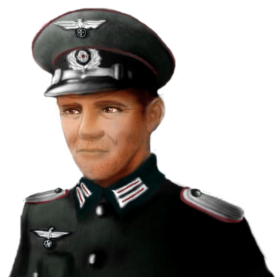
First, we start with the portrait of the german "Leutnant". Let me know, what you think about it! The picture is made by "Koopanda". (Thank you very much!)
Last edited by Ruglud on October 3rd, 2012, 7:30 pm, edited 2 times in total.
Wenn Unrecht zu Recht wird, wird Widerstand zur Pflicht!
Nerdguygaming.tumblr.com
Nerdguygaming.tumblr.com

Re: The Art of "Battle for Westfront"
I like it but I feel there is something wrong with the shoulders- especially the left one; meanwhile, his expression is a little unclear.
High over valleys in the red levelling rays -
In din of crowded streets, going among the years, the faces,
May I still meet my memory in so lonely a place
Between the streams and the red clouds, hearing the curlews, Hearing the horizons endure.
In din of crowded streets, going among the years, the faces,
May I still meet my memory in so lonely a place
Between the streams and the red clouds, hearing the curlews, Hearing the horizons endure.
Re: The Art of "Battle for Westfront"
@Kanzil: Its not the final version. The shoulders will be changed. Shoulderbadges are missing, too.
Aircraft
BF 109b:

Ju 87b:

PZL 37:

PZL P24:

Anti-Aircraft
Flak38:

40mm Bofors:

Aircraft
BF 109b:
Ju 87b:
PZL 37:
PZL P24:
Anti-Aircraft
Flak38:
40mm Bofors:
Last edited by Ruglud on September 29th, 2012, 9:32 am, edited 1 time in total.
Wenn Unrecht zu Recht wird, wird Widerstand zur Pflicht!
Nerdguygaming.tumblr.com
Nerdguygaming.tumblr.com

Re: The Art of "Battle for Westfront"
The units need a lot of work. They are quite dark and extremely smudgy. To clean them up you need to get rid of the unnecessary transparent pixels and adjust the contrast. I would suggest to reduce the colors in the palette too.
Re: The Art of "Battle for Westfront"
Thanks for your meaning. I reworked the sprites. Hope you like them now.SFault wrote:The units need a lot of work. They are quite dark and extremely smudgy. To clean them up you need to get rid of the unnecessary transparent pixels and adjust the contrast. I would suggest to reduce the colors in the palette too.
And the aircraft and anti-aircraft from France and Italy:
Dewoitine d520:

LeO 45:

MC.200:

SM 79

2cm Scotti:

Hotchkiss 25mm Anti-aircraft:

Wenn Unrecht zu Recht wird, wird Widerstand zur Pflicht!
Nerdguygaming.tumblr.com
Nerdguygaming.tumblr.com
Re: The Art of "Battle for Westfront"
There's still plenty of smudge going on. Here's a quick sample of fixed outlines to demonstrate what I mean by cleaning up. It still needs to be fixed with smaller color palette.
- Attachments
-
- No transparency
- plane.png (2.7 KiB) Viewed 5121 times
Re: The Art of "Battle for Westfront"
Now, I know what you mean.
Some sprites are a litte to, so called, "smudge". But on many sprites, it looks much realisitic for me.
Dont forget, its version 0.5. Before I release the 1.0, I will rework most parts of Battle for Westfront and of course, the sprites. Thank you for your comment and your example!
Some sprites are a litte to, so called, "smudge". But on many sprites, it looks much realisitic for me.
Dont forget, its version 0.5. Before I release the 1.0, I will rework most parts of Battle for Westfront and of course, the sprites. Thank you for your comment and your example!
Wenn Unrecht zu Recht wird, wird Widerstand zur Pflicht!
Nerdguygaming.tumblr.com
Nerdguygaming.tumblr.com

Re: The Art of "Battle for Westfront"
Quick tip: having smudgy sprites (semi-transparent pixels) and palettes with lots of colors is usually the result of using the brush tool instead of the pencil one. Do not use the brush tool in pixel art (bucket fill and line tool are fine, though). Your portrait is cool, so I take it you are somewhat used to work with a tablette and the brush tool, but don't do this for sprites. And stick to relatively small palettes (~10-30 colors?). Both these will make your sprites look cleaner, crisper (pop more against the background) and much, much easier to edit (would you someday like to correct or animate them). There are some pixel art tutorials by Jetrel in the Art Development sub-forum, you should give them a good read if you haven't already, it's pretty interesting
Edit: just realised you weren't the portrait's author. My bad. Comments still apply, though.
Edit: just realised you weren't the portrait's author. My bad. Comments still apply, though.
Jazz is not dead, it just smells funny - Frank Zappa
Current projects: Internet meme Era, The Settlers of Wesnoth
Current projects: Internet meme Era, The Settlers of Wesnoth
-
homunculus

- Posts: 537
- Joined: July 21st, 2010, 9:47 pm
Re: The Art of "Battle for Westfront"
in the portrait the eyes and the face seem to be from different worlds.
i would suggest trying things like increasing contrast on the face, or burning the shadows, or maybe increasing saturation.
i mean, i notice a lot of "gray fog" in the shadows in the face.
also, splashes of color may look better than completely smooth.
i would suggest trying things like increasing contrast on the face, or burning the shadows, or maybe increasing saturation.
i mean, i notice a lot of "gray fog" in the shadows in the face.
also, splashes of color may look better than completely smooth.
Re: The Art of "Battle for Westfront"
Only negative critique is not what I expected...  I will pass the critique on the portrait through to Koopanda. Additionally I rework the sprites by release of 1.0 at the latest.
Wenn Unrecht zu Recht wird, wird Widerstand zur Pflicht!
Nerdguygaming.tumblr.com
Nerdguygaming.tumblr.com
-
homunculus
- Posts: 537
- Joined: July 21st, 2010, 9:47 pm
Re: The Art of "Battle for Westfront"
well, my own opinion about positive comments is:Ruglud wrote:Only negative critique is not what I expected...
"keep it brief, please, or at least try to be specific, but specific is only useful if i might not already know. because it is a waste of time otherwise."
but if you want positive comments, then the portrait does seem to have a clear expression and some personality, and it seems good enough to be usable already.
and negative critique can be quite different.
for example, i didn't write: "do you see deformed shapes like this when you look in the mirror?"
Re: The Art of "Battle for Westfront"
Positive comments can be a motivational factor. And positive doesnt mean, that nobody can write negative things, or general what they dont like.
But I understand your point of view.
In your "positive" comment, I can read nothing about the sprites, this is negative for me, too.
Kind regards
But I understand your point of view.
In your "positive" comment, I can read nothing about the sprites, this is negative for me, too.
Kind regards
Wenn Unrecht zu Recht wird, wird Widerstand zur Pflicht!
Nerdguygaming.tumblr.com
Nerdguygaming.tumblr.com
Re: The Art of "Battle for Westfront"
Well, having comment in itself is kinda a positive comment, you know. I mean, if people considered this to be a total unsavable train wreck (and/or by a totally hermetic author who doesn't care), they wouldn't bother trying to help improve the work with comments.
Your sprites are not bad, in general, and they are a good starting point to going somewhere cool. IMHO, appart from SFault's comments, I'd say they use a bit too much pitch black outlines and you should be careful with the facing: some of them face an acceptable 30-45 degrees (LeO 45, SM 79, etc.) and the AA guns are probably passable in this regard (although they could be improved) but some others (BF 109b, Dewoitine d520, etc.) are mostly seen sideways, and this will look weird in game.
Your sprites are not bad, in general, and they are a good starting point to going somewhere cool. IMHO, appart from SFault's comments, I'd say they use a bit too much pitch black outlines and you should be careful with the facing: some of them face an acceptable 30-45 degrees (LeO 45, SM 79, etc.) and the AA guns are probably passable in this regard (although they could be improved) but some others (BF 109b, Dewoitine d520, etc.) are mostly seen sideways, and this will look weird in game.
Jazz is not dead, it just smells funny - Frank Zappa
Current projects: Internet meme Era, The Settlers of Wesnoth
Current projects: Internet meme Era, The Settlers of Wesnoth
Re: The Art of "Battle for Westfront"
This is exactly what I trying to do. If you take a look on all the updates before, you can see that I implement many wishes from users, or reworked things in result of feedback. Same now with the sprites. But as I said before, all content is under review as long the version 1.0 isnt out.Dixie wrote:Well, having comment in itself is kinda a positive comment, you know. I mean, if people considered this to be a total unsavable train wreck (and/or by a totally hermetic author who doesn't care), they wouldn't bother trying to help improve the work with comments.
Its my first "Mod"/"Era" etc. I never do something like this before. Give me time, spend patience. Ill do my best.
Wenn Unrecht zu Recht wird, wird Widerstand zur Pflicht!
Nerdguygaming.tumblr.com
Nerdguygaming.tumblr.com
Re: The Art of "Battle for Westfront"
I'm sure you will. An era is a lot of work, so you have to thoroughly enjoy it to ever see it through. I was mostly trying to cheer you up about the criticism thing. A lot of people start projects and don't get much comments. Or, in rarer and worst cases, non-constructive comments. Both these cases are much more depressing. Yours might not exactly be endless flows of praises, but at least they are trying to help. Don't give up!Ruglud wrote:Its my first "Mod"/"Era" etc. I never do something like this before. Give me time, spend patience. Ill do my best.
Jazz is not dead, it just smells funny - Frank Zappa
Current projects: Internet meme Era, The Settlers of Wesnoth
Current projects: Internet meme Era, The Settlers of Wesnoth