Wesnoth logo favicon
Moderator: Forum Moderators
Forum rules
Before posting critique in this forum, you must read the following thread:
Before posting critique in this forum, you must read the following thread:

Wesnoth logo favicon
I was looking to see if there was a small version of the Wesnoth logo for a project I'm working on that could work as a favicon (as next to the web address for a web page) and it appears, there isn't.
In order for it to be a proper icon, it needs to be 16x16 and use only web-safe colors. Also, as icons are a representation of a larger image, the iconic parts of the logo should be noticeable and not blurry (such as the swords behind the shield).
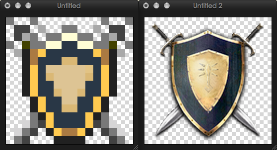 Here's my attempt, though I will profess I'm not much of a pixel artist. I'm not content with the hilts on the swords; some structure is missing there. Perhaps you can do better, or improve upon my hastily-drawn pixels?
In order for it to be a proper icon, it needs to be 16x16 and use only web-safe colors. Also, as icons are a representation of a larger image, the iconic parts of the logo should be noticeable and not blurry (such as the swords behind the shield).
- Attachments
-
- Wesnoth 16x16 favicon. Perhaps you can do better?
- wesnoth-icon.png (262 Bytes) Viewed 5394 times
Last edited by ancestral on November 8th, 2010, 8:23 pm, edited 1 time in total.
Wesnoth Bestiary ( PREVIEW IT HERE )
Unit tree and stat browser
Canvas ( PREVIEW IT HERE )
Exp. map viewer
Unit tree and stat browser
Canvas ( PREVIEW IT HERE )
Exp. map viewer
-
Eleazar

- Retired Terrain Art Director
- Posts: 2481
- Joined: July 16th, 2004, 1:47 am
- Location: US Midwest
- Contact:
Re: Wesnoth logo favicon
Get rid of the swords i think-- they are too small to be "legible" at that size, and it gives you one more vertical pixel for the shield
Feel free to PM me if you start a new terrain oriented thread. It's easy for me to miss them among all the other art threads.
-> What i might be working on
Attempting Lucidity
-> What i might be working on
Attempting Lucidity
-
Golden_Soldier

- Posts: 265
- Joined: July 20th, 2010, 10:26 pm
- Location: Roanoke
Re: Wesnoth logo favicon
I think it wouldnt look right without the swords and although they probably need some fixing up they should still be included
-
Mountain_King

- Translator
- Posts: 569
- Joined: May 31st, 2010, 7:54 pm
Re: Wesnoth logo favicon
Best Regards,
Mountain_King
Projects: Ice Age Fun, Japhel's Journey (same link), Shameless Crossover Excuse (Maintainer), and Age of Dinosaurs!
Is cothabhálach an aistriúcháin Gaeilge mé.
EXTERMINATE!!!!
Is cothabhálach an aistriúcháin Gaeilge mé.
EXTERMINATE!!!!

Re: Wesnoth logo favicon
I agree. The highlights on the top of the shield's trimming look out of place, although that may be the forum background I'm using. Here's my attempt:
- Attachments
-
-
- wesnoth-icon4.png (328 Bytes) Viewed 5276 times
Ecce, in caelo! Est avem! Minime, est vehiculum aerem! Minime, est virum Latinum!
-
dipseydoodle

- Posts: 879
- Joined: September 16th, 2008, 10:26 pm
Re: Wesnoth logo favicon
Not bad but I can't exactly tell where the light is coming from. Darker darks and Brighter Highlights would be my advice.
-
Simons Mith

- Posts: 821
- Joined: January 27th, 2005, 10:46 pm
- Location: Twickenham
- Contact:
Re: Wesnoth logo favicon
For comparison, armorgames.com has a good shield favicon. I notice that they have a pair of swords in their main logo too, and they've ditched them altogether for their favicon. They've also gone for a smoothed style rather than the sharp borders between colours of these Wesnoth attempts.