homunculus's two pixels
Moderator: Forum Moderators
Forum rules
Before posting critique in this forum, you must read the following thread:
Before posting critique in this forum, you must read the following thread:
-
dirtywhitellama

- Posts: 45
- Joined: February 4th, 2011, 3:42 pm
Re: homunculus's two pixels
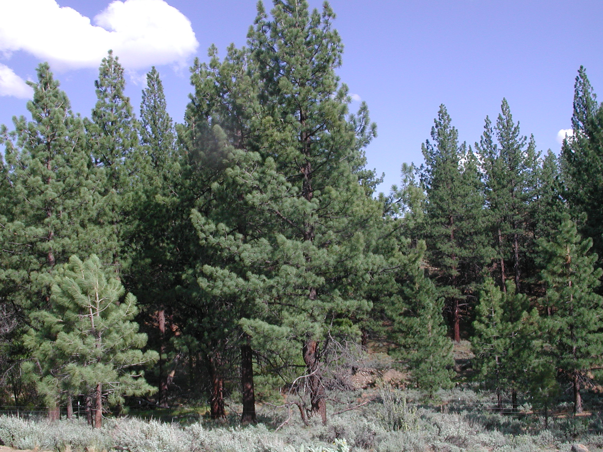
the arches of the branches are OK, but if you mean the overall shape of the tree, it might be more convincing if it were wider at the bottom and narrower/more pointed at the top. http://www.peterstellasfarm.com/photo/red_pine-.jpghomunculus wrote: In the meantime I have also noticed that greens of the individual branches should not form an arch (although most of the greens are usually on the surface of the cone), but a triangle.
And the individual branch tips might have bit different shape, more elongated maybe, and bit different colors and shading (no good idea how to do it efficiently, at the moment).
the larger branches do get a gentle curve but the branches at the top of the trees tend to be quite upright.
here is a ponderosa pine which is the kind I am used to seeing the most around where I live: http://www.donerickson.com/evergreens/pine1.jpg
The young tree you found has a typical shape but obviously the scale is smaller; also the foliage is a lot brighter than mature pines tend to be. This one might give you a better idea of overall scale: http://www.ecosystemswest.com/Images/Ph ... forest.JPG
-
homunculus

- Posts: 537
- Joined: July 21st, 2010, 9:47 pm
Re: homunculus's two pixels
This is what I got with the Pisa redraw at the moment, the south-west one seems best, I think (as usual, the image somehow gets resized/blurred in forum, 'view image' helps).
And, some creeping silverism for the heck of it.
And some thoughts about how I understand shading (which can be flawed, and criticism is most welcome).
(maybe I'll need to repost it some day into last post, where it could attract some attention, right now I just put it in an old post because I want to use it in another thread)
And, some creeping silverism for the heck of it.
- pisa.png (139.01 KiB) Viewed 7191 times
- lights.gif (17.69 KiB) Viewed 7133 times
Last edited by homunculus on October 29th, 2011, 12:15 pm, edited 1 time in total.
-
dirtywhitellama
- Posts: 45
- Joined: February 4th, 2011, 3:42 pm
Re: homunculus's two pixels
Im not sure I can tell the difference between the two that aren't silver, except maybe one has less black in it? either one looks fine to me, they actually look like trees now  the silver one is perhaps a little too silver for most circumstances, but maybe darken it a bit (keeping the lower saturation) and add snow for a winter one? seems to me the evergreens are less saturated in the winter, or maybe make that more green in the spring/summer when they have fresh growth Actually, even just darkening it might be good for an autumn shot, if you're so inclined.
Re: homunculus's two pixels
I find these nice and very poetic great houses!
-
homunculus
- Posts: 537
- Joined: July 21st, 2010, 9:47 pm
Re: homunculus's two pixels
Those are all the tree houses:
And those are the extras that also didn't look too terrible:
As usual, opening the image in a separate tab (outside forum) shows the real scale.
The last redraws were:
1) Midway intense blossoms for the spring version of the 4-lantern tree.
2) The greens and roof of the leaning tower, the main one is supposed to look like a pine with long needles (mainly Siberian Pine, previously I called it Siberian Cedar which is wrongly translated from Russian) and the one in the extras is colored as Silver Fir, though a real Silver Fir does not have such long needles and has differently shaped branches. Silver Fir should grow quite far south, like Italy, but I do not know if it might be limited to colder mountain regions.
It is true that evergreens also change their color a bit, in spring when they have fresh growths and some small blossom like things, and also somewhat in autumn, but the differences being somewhat small, I hope one image covers the seasonal variations of the evergreens reasonably.
It was suggested that I might try making the lanterns blink, which would be somewhat easy by making slight transparency and/or hue adjustments to the light layers (if circulating light patterns can be avoided), but I had a bad feeling about it, and I now think I can name this "bad feeling" as "it would be bit too arrogant", as the tree houses are brighter than most terrain graphics already.
In the terrain-graphics.cfg in the add-on, I made the tree houses forest terrain, which I am doubtful about for balance reasons, as some elves might get 70% defense in village that way, instead of the usual 60%.
- shot2.png (136.3 KiB) Viewed 7122 times
The last redraws were:
1) Midway intense blossoms for the spring version of the 4-lantern tree.
2) The greens and roof of the leaning tower, the main one is supposed to look like a pine with long needles (mainly Siberian Pine, previously I called it Siberian Cedar which is wrongly translated from Russian) and the one in the extras is colored as Silver Fir, though a real Silver Fir does not have such long needles and has differently shaped branches. Silver Fir should grow quite far south, like Italy, but I do not know if it might be limited to colder mountain regions.
It is true that evergreens also change their color a bit, in spring when they have fresh growths and some small blossom like things, and also somewhat in autumn, but the differences being somewhat small, I hope one image covers the seasonal variations of the evergreens reasonably.
It was suggested that I might try making the lanterns blink, which would be somewhat easy by making slight transparency and/or hue adjustments to the light layers (if circulating light patterns can be avoided), but I had a bad feeling about it, and I now think I can name this "bad feeling" as "it would be bit too arrogant", as the tree houses are brighter than most terrain graphics already.
In the terrain-graphics.cfg in the add-on, I made the tree houses forest terrain, which I am doubtful about for balance reasons, as some elves might get 70% defense in village that way, instead of the usual 60%.
fill shot for some fun (i'll remove it when i'll do cleanup):
- Attachments
-
 extras.zip
- (60.35 KiB) Downloaded 382 times
-
- Tree_House_Villages.zip
- (283.72 KiB) Downloaded 456 times
-
homunculus
- Posts: 537
- Joined: July 21st, 2010, 9:47 pm
Re: homunculus's two pixels
Now that I think of it, I can see the tree houses in map editor when Tree_House_Villages.zip is unpacked in add-ons, but I have no clue how, say, an UMC author would use the tree houses in a campaign.
Not that I would suddenly start making maps or be effected by that in any way myself, because it seems I am not even playing the game (prefer nethack and FreeCol), but some instruction about what to do with the download would be a reasonable thing to have near the downloads, because people who download it might not know how to get it to work (other than in editor).
Some +terrain should be included in main.cfg of a campaign somehow?
Found an interesting video that could be useful for animating faery wings.
http://www.youtube.com/watch?v=ppavEpDSoMc
But it seems I am sort of floating towards Weabreak or semi-Wesbreak, and I don't feel like drawing something complicated for a while.
Had some giant clam sketch for Inky's Quest, I guess that is simple (and fun) enough to spend time drawing for a while, so I better put the basic sketch here.
I think there should be more shell and less soft tissue visible, and the curves on the shell should be the other way round.
Inky's Quest is a rather humorous campaign (at least was, the author wrote he cut out some if it, and I haven't tested, maybe it is like white bread without raisins now), and such clam would be suitable, but maybe a more serious looking clam would also be useful for someone?
Not that I would suddenly start making maps or be effected by that in any way myself, because it seems I am not even playing the game (prefer nethack and FreeCol), but some instruction about what to do with the download would be a reasonable thing to have near the downloads, because people who download it might not know how to get it to work (other than in editor).
Some +terrain should be included in main.cfg of a campaign somehow?
Found an interesting video that could be useful for animating faery wings.
http://www.youtube.com/watch?v=ppavEpDSoMc
But it seems I am sort of floating towards Weabreak or semi-Wesbreak, and I don't feel like drawing something complicated for a while.
Had some giant clam sketch for Inky's Quest, I guess that is simple (and fun) enough to spend time drawing for a while, so I better put the basic sketch here.
- giant_clam_shooting_a_pearl.gif (4.38 KiB) Viewed 7063 times
Inky's Quest is a rather humorous campaign (at least was, the author wrote he cut out some if it, and I haven't tested, maybe it is like white bread without raisins now), and such clam would be suitable, but maybe a more serious looking clam would also be useful for someone?

Re: homunculus's two pixels
Nope. They just have to copy the files to their campaign directory, merge the _main.cfg, terrain.cfg and terraign_graphics.cfg files with their own ones (if there are any) and specify the same {~includes} between their #ifdef CAMPAIGN_NAME ...#endif directives as you did in #ifdef EDITOR ... #endif (with obviously replacing 'Tree_House_Villages' with their campaign directory all along the way).Some +terrain should be included in main.cfg of a campaign somehow?
-
homunculus
- Posts: 537
- Joined: July 21st, 2010, 9:47 pm
Re: homunculus's two pixels
after a few failed attempts i think i am making progress with something like clam animation guides:
and here is some preliminary shading:
i am wondering if the curved "ribs" of the shell look curved outwards, or if it looks jagged.
or if anything else is wrong or suspicious.
- att_anim_0.gif (10.56 KiB) Viewed 6857 times
- clamsketch.png (3.44 KiB) Viewed 6857 times
or if anything else is wrong or suspicious.

Re: homunculus's two pixels
Not bad, how would it look with an extra frame hold while at full open?
Edit: This is how (3 frame hold):
Edit: This is how (3 frame hold):
- Attachments
-
- att_anim_edit2.gif (14.23 KiB) Viewed 6846 times
-
dirtywhitellama
- Posts: 45
- Joined: February 4th, 2011, 3:42 pm
Re: homunculus's two pixels
The edge looks a little sharp. If you look up giant sea clams, as opposed to the smaller varieties that fit easily in your hand, you will see they mostly have a thick fleshy edge to the shell. (and can often be some very amazing colors inside as well as out!) The scallops also look a little too steeply peaked, IE, they should have a softer curve on the outside rather than seeming pointed.
The extra frame of pause makes it work a lot better also.
The extra frame of pause makes it work a lot better also.
Re: homunculus's two pixels
The tree houses are awesome! I'd enjoy it more though if it wasn't so colorful It looks quite like a party going on from a distance. A warm light emitting from the insides feels much more appropriate IMO.
-
homunculus
- Posts: 537
- Joined: July 21st, 2010, 9:47 pm
Re: homunculus's two pixels
@Crow_T
Yes, the way it is at the moment, with equal timed frames, some the extreme (most open and most closed) frames disappear.
It remains to be seen what it will look like with shaded shell, because right now the lines of the extreme frames merge with the previous frame, unless the viewer very well knows what he is looking at.
As for the delays and things, maybe the extreme frames will end up lasting a little longer, or maybe there will be one more intermediate frame that makes the animation smoother.
At the moment I was attempting a "snap" effect with that last open frame.
@dirtywhitellama
I am trying to make the shell look solid, and I think if I keep the geometry as correct and consistent as I can, maybe it will look more solid.
The soft tissue inside will need to look less consistent in the frames and, as far as I have seen, will look more soft and wobbly as a result (as opposed to current cuttlefish animation which is too consistent and therefore looks solid in my opinion).
And there is this 'glossy lips' idea that I rather like, but in the initial sketch the lips were too prominent.
I don't know if I can fit smaller lips there.
If I attempt a realistic giant clam, the soft tissue anatomy would be such that it might end up needing bikinis, so I would rather do glossy lips.
Just the shell at the moment, because I am undecided about what I will end up with.
As for the 'pointed outside', it is supposed to be pointed inside
@orangebox
Looking at those tree houses later, I have thought about the same thing.
If I did them now, they would have less saturation and would be greatly simplified and more drawing-like (I doubt that is going to happen, though).
Right now they look bit naive to me, which isn't necessarily a bad thing, I don't know.
Also, I looked at them on LCD (I am using traditional monitor myself), and they looked really bad, maybe the LCD monitor's settings were off, but I can't be sure.
And, of course, I would need to dive into WML again to finish the treehouse project with the WML the way I think would be right.
-
dirtywhitellama
- Posts: 45
- Joined: February 4th, 2011, 3:42 pm
Re: homunculus's two pixels
I think you misunderstood me, the downward points are fine, it just looks like the upward curves are nearly pointed also. I'm assuming lighting is from the upper right.homunculus wrote: As for the 'pointed outside', it is supposed to be pointed inside
-
homunculus
- Posts: 537
- Joined: July 21st, 2010, 9:47 pm
Re: homunculus's two pixels
yeah, it wasn't quite clear what you meant there.dirtywhitellama wrote:I think you misunderstood me, the downward points are fine, it just looks like the upward curves are nearly pointed also. I'm assuming lighting is from the upper right.
this was one of the things i was concerned about and wished for feedback on : )
-
dirtywhitellama
- Posts: 45
- Joined: February 4th, 2011, 3:42 pm
Re: homunculus's two pixels
I think a smoother gradient would help. looking forward to seeing it in a more "done" state