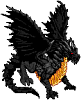
homunculus's two pixels
Moderator: Forum Moderators
Forum rules
Before posting critique in this forum, you must read the following thread:
Before posting critique in this forum, you must read the following thread:
-
homunculus

- Posts: 537
- Joined: July 21st, 2010, 9:47 pm
homunculus's two pixels
about c&c:
different people pay attention to and notice different things.
so, if you see a flaw, or have a suggestion for different design, please do not hesitate to c&c.
it is very likely that you will direct my attention to a flaw or a possible improvement that i didn't notice before, and it might otherwise take months or years to figure it out on my own.
c&c for small flaws is also welcome.
if you c&c, then your time will become mine, tenfold ; )
/edit
the first one is an elvish flag that i did some time ago for umc, but now that i started to read this forum i am getting some ideas how to improve it. thought about doing it sometime this week, but got distracted by the next two pixels.
i am still intending to improve the flag when i find time, though.
lots of things to experiment with, i am thinking of trying to make the pole less prominent, and maybe look for ways to make the general color of the flag lighter.
a forest fire terrain sketch that some destructive umc makers might be interested in, maybe.
the most disturbing issue seems to be how the face looks too static.
and maybe the fire is stretched too much.
i don't know, maybe i am imagining it all, and am intending to correct the wrong things.
and a slightly animated young yeti for umc, hurt my eyes when i tried it in game.
as far as i can see, there is some dirt in the background, and some limbs are out of place, but i am mainly struggling with increasing the contrast.
and i think i read somewhere that lining units is not recommended.
anyway, it was intended as a fun sprite, i am thinking of dropping it as far as my umc goes.
all of those are work in progress, all criticisms, suggestions, and alternative design ideas welcome.
different people pay attention to and notice different things.
so, if you see a flaw, or have a suggestion for different design, please do not hesitate to c&c.
it is very likely that you will direct my attention to a flaw or a possible improvement that i didn't notice before, and it might otherwise take months or years to figure it out on my own.
c&c for small flaws is also welcome.
if you c&c, then your time will become mine, tenfold ; )
/edit
the first one is an elvish flag that i did some time ago for umc, but now that i started to read this forum i am getting some ideas how to improve it. thought about doing it sometime this week, but got distracted by the next two pixels.
i am still intending to improve the flag when i find time, though.
lots of things to experiment with, i am thinking of trying to make the pole less prominent, and maybe look for ways to make the general color of the flag lighter.
- wood-elvish-flag.gif (17.45 KiB) Viewed 13009 times
the most disturbing issue seems to be how the face looks too static.
and maybe the fire is stretched too much.
i don't know, maybe i am imagining it all, and am intending to correct the wrong things.
- fire.gif (35.43 KiB) Viewed 13009 times
as far as i can see, there is some dirt in the background, and some limbs are out of place, but i am mainly struggling with increasing the contrast.
and i think i read somewhere that lining units is not recommended.
anyway, it was intended as a fun sprite, i am thinking of dropping it as far as my umc goes.
- young-yeti.gif (28.05 KiB) Viewed 13009 times
Last edited by homunculus on January 4th, 2011, 3:52 am, edited 3 times in total.
-
thespaceinvader

- Retired Art Director
- Posts: 8414
- Joined: August 25th, 2007, 10:12 am
- Location: Oxford, UK
- Contact:
Re: homunculus's two pixels
Other way round. Outlining is HIGHLY recommended.
http://thespaceinvader.co.uk | http://thespaceinvader.deviantart.com
Back to work. Current projects: Catching up on commits. Picking Meridia back up. Sprite animations, many and varied.
Back to work. Current projects: Catching up on commits. Picking Meridia back up. Sprite animations, many and varied.
-
artisticdude

- Moderator Emeritus
- Posts: 2424
- Joined: December 15th, 2009, 12:37 pm
- Location: Somewhere in the middle of everything
Re: homunculus's two pixels
Increasing contrast will help this, as will giving the sprite an outline. The outline will make it stand out from the terrain (thus making it look more like a foreground element than a background one), and will give it a sharper, cleaner look. I'd advise using the mainline yeti for reference.homunculus wrote:and a slightly animated young yeti for umc, hurt my eyes when i tried it in game.
"I'm never wrong. One time I thought I was wrong, but I was mistaken."

Re: homunculus's two pixels
Aww... the yeti is so cute. 
Homunculus may be thinking of a thread where someone used too many (or too thick) pure black lines.thespaceinvader wrote:Other way round. Outlining is HIGHLY recommended.
http://www.wesnoth.org/wiki/User:Sapient... "Looks like your skills saved us again. Uh, well at least, they saved Soarin's apple pie."
-
Midnight_Carnival

- Posts: 836
- Joined: September 6th, 2008, 11:08 am
- Location: On the beach at sunset, gathering coral
Re: homunculus's two pixels
Hello
I would suggest that you move away from showing the hex tiles. I know you probalby just want to show what your terrain/units (hell, a Yeti is almost terrain!) look like in the game, but things like your very nice looking forest fire are likely to extend beyond the borders of a single hex tile anyway.
Agree that the Yeti is cute, but it's arms and legs look funny when it moves.
Well, that's my 2 cents worth, keep up the good work.
...apparenly we can't go with it or something.
-
homunculus
- Posts: 537
- Joined: July 21st, 2010, 9:47 pm
Re: homunculus's two pixels
while playing some campaigns i noticed that i needed to squint my eyes in order to make the difference between silver mages and the white mage line (first three mages in the image below).
so i made a recolor attempt for the silver, and also for the gold mage (last two mages in the image).
there is some overall cleanup done (number of colors and background dirt), and some very minor edit on the lower corner of the robe.
i was trying to keep the edits minimal, although i could think of some more edits, including making the highlights on lower and upper part of the robe more even, and adding a bright highlight in some animation frames, like a reflection flash from polished silver.
however, afaik modifications to mainline sprites are uncalled for, and differentiation between silver and white mage is accomplished for my own purposes, so unless i am told that i might take a stab at editing more and see what comes of it, further edits will be extremely low priority (except maybe reduction of gold mage saturation, as suggested by zero in another thread).
so i made a recolor attempt for the silver, and also for the gold mage (last two mages in the image).
- recolor-sample.png (11.49 KiB) Viewed 12327 times
i was trying to keep the edits minimal, although i could think of some more edits, including making the highlights on lower and upper part of the robe more even, and adding a bright highlight in some animation frames, like a reflection flash from polished silver.
however, afaik modifications to mainline sprites are uncalled for, and differentiation between silver and white mage is accomplished for my own purposes, so unless i am told that i might take a stab at editing more and see what comes of it, further edits will be extremely low priority (except maybe reduction of gold mage saturation, as suggested by zero in another thread).
- Attachments
-
 silver.zip
- silver mage recolor split into images ready for use.
- (59.28 KiB) Downloaded 650 times
-
- gold.zip
- gold mage recolor split into images ready for use.
- (61.97 KiB) Downloaded 670 times
-
 silver_recolor.xcf
- the gimp file that contains silver mage split into parts (robe, cloak, face, etc.) and cleanup as i thought was best.
can be useful if you want to recolor differently, or make a frankie or something. - (1.04 MiB) Downloaded 916 times
-
homunculus
- Posts: 537
- Joined: July 21st, 2010, 9:47 pm
Re: homunculus's two pixels
it might be nice to have drawings collected in one place, so
i have been trying to do some sprites here and there, and a chameleon sprite seems to be completed as far as i can tell.
also, have been doing some rough portrait sketches for my campaign, especially where default portraits or portraits from other campaigns might have been most misleading.
i have very little experience at drawing humans (if something is drawn correctly it was probably a lucky wobble of the mouse), so i might need some help noticing the most glaring flaws.
ruth is orc female, now wearing a breastplate made for males that she scavenged from a death knight:
and then i have been very slowly experimenting with the wood-elvish flag, which has progressed to this state atm.
edit: removed the flag.gif from here and put it in the next post where the download is.
i think it is less confusing that way.
no idea if anyone might find such flag useful, so far no one has said anything about liking or disliking this concept.
i have been trying to do some sprites here and there, and a chameleon sprite seems to be completed as far as i can tell.
- unit.png (1.43 KiB) Viewed 12297 times
i have very little experience at drawing humans (if something is drawn correctly it was probably a lucky wobble of the mouse), so i might need some help noticing the most glaring flaws.
- ruth-young-forumsize.png (53.63 KiB) Viewed 12190 times
- ruth-armor-forumsize.png (45.42 KiB) Viewed 12190 times
edit: removed the flag.gif from here and put it in the next post where the download is.
i think it is less confusing that way.
no idea if anyone might find such flag useful, so far no one has said anything about liking or disliking this concept.
Last edited by homunculus on February 8th, 2011, 6:12 pm, edited 2 times in total.
Re: homunculus's two pixels
the only thing about the 'humanity' of those ports I could notice is the huge eyes on the young one, seem to start ok on the lower part, but some of the upper should rather end at eyebrows, right now they do run a couple of pixels too high
that's a very nice tech for those fur linings
but the breastplate needs some roughing up..looted from a death knight you say? the kind of undead nasty? then it should look waaay more tarnished, especially the decorations which seem to have come from times when the knight was still alive and nice
as for the flag - well it is nice, but I admit I'd have no idea how to make use of it
Like cats? I've made a whole faction of them to kick ass with!
Don't like cats? I've made a whole faction of them to kick their asses! So everyone's happy :)
Felinian faction is part of the Beyond Southern Hells era
kitties need sprites! art topic here
Don't like cats? I've made a whole faction of them to kick their asses! So everyone's happy :)
Felinian faction is part of the Beyond Southern Hells era
kitties need sprites! art topic here
-
homunculus
- Posts: 537
- Joined: July 21st, 2010, 9:47 pm
Re: homunculus's two pixels
the eyes, yeah, now that i look at them that way, it seems ruth had a thyroid gland disorder in youth, making the eyes pop out like that.
even though i like the cartoony large eyes i should certainly remove the white above the irises.
the death knight was listening to the petty orcs talking, until one day through extensive practice of turning in his grave the death knight figured out how to become animated.
there could be wear and tear, but just as much as happened when the death knight still lived plus the wear and tear from turning in the grave.
otherwise it should be a bronze plate covered with pearly glaze (so that it would look unsuitable for an orc).
there are two other problems i am most worried about.
the strongest line in the picture is the line between ruth's eyes and the two stones she is holding, but so far i have not figured out how the pose could make use of that
the shape of the upper part of the armor might be terribly wrong because the reference (the only one i used in the whole picture) was a bodybuilder posing core muscles with shoulders too much forward.
made some minor corrections to the portraits, i think it is a slight improvement.
no wear and tear on the armor, though, thought it would look weird as long as some parts are not even shaded at all.
tested my campaign a bit and saw the flags in game again, and they looked decent enough, i guess i better post the files and draw something else (unless someone points out some flaws).
if they are unpacked in images/flags folder in a campaign, they can be used within the side tag with the core macro like this:simple, isn't it?
and i think i have an idea what elvish tree houses could look like.
it would be somewhat like a paper lantern hanging from a tree, and it would be made of a lightweight material, like some light sticks and faery wings for the flats.
it is at 200% size atm, i think i might need to raise the house higher in the tree so that there would be more space to draw the hanging house a bit larger.
and maybe hexagonal would look better as fearies might have more insect-like architectural preferences.
or maybe it should be more like some kind of silkworm cocoon thing.
now, they wanted a treehouse for mainline, and there wouldn't be much other reason to do it.
and in that case i wouldn't have much freedom to do whatever heck i feel like, so if faery wings are not ok or something, that would be a problem.
therefore, rough concept sketches first, because i wouldn't want to waste more time on it if the concept is unsuitable.
some bee or wasp nests also have a characteristic texture, or maybe something like a decorative straw basket.
and i think i am open for more ideas.
even though i like the cartoony large eyes i should certainly remove the white above the irises.
the death knight was listening to the petty orcs talking, until one day through extensive practice of turning in his grave the death knight figured out how to become animated.
there could be wear and tear, but just as much as happened when the death knight still lived plus the wear and tear from turning in the grave.
otherwise it should be a bronze plate covered with pearly glaze (so that it would look unsuitable for an orc).
there are two other problems i am most worried about.
the strongest line in the picture is the line between ruth's eyes and the two stones she is holding, but so far i have not figured out how the pose could make use of that
the shape of the upper part of the armor might be terribly wrong because the reference (the only one i used in the whole picture) was a bodybuilder posing core muscles with shoulders too much forward.
made some minor corrections to the portraits, i think it is a slight improvement.
no wear and tear on the armor, though, thought it would look weird as long as some parts are not even shaded at all.
the flag could be useful in umc-s for example, as the elves do not have a thematic flag as far as i know.StDrake wrote:[...]as for the flag - well it is nice, but I admit I'd have no idea how to make use of it
tested my campaign a bit and saw the flags in game again, and they looked decent enough, i guess i better post the files and draw something else (unless someone points out some flaws).
if they are unpacked in images/flags folder in a campaign, they can be used within the side tag with the core macro like this:
Code: Select all
{FLAG_VARIANT wood-elvish}- flag.gif (17.63 KiB) Viewed 12163 times
- flags.zip
- (4.15 KiB) Downloaded 654 times
it would be somewhat like a paper lantern hanging from a tree, and it would be made of a lightweight material, like some light sticks and faery wings for the flats.
- firstsketch.png (37.42 KiB) Viewed 12157 times
and maybe hexagonal would look better as fearies might have more insect-like architectural preferences.
or maybe it should be more like some kind of silkworm cocoon thing.
- cocoon.png (36.7 KiB) Viewed 12157 times
and in that case i wouldn't have much freedom to do whatever heck i feel like, so if faery wings are not ok or something, that would be a problem.
therefore, rough concept sketches first, because i wouldn't want to waste more time on it if the concept is unsuitable.
some bee or wasp nests also have a characteristic texture, or maybe something like a decorative straw basket.
and i think i am open for more ideas.
-
Eleazar

- Retired Terrain Art Director
- Posts: 2481
- Joined: July 16th, 2004, 1:47 am
- Location: US Midwest
- Contact:
Re: homunculus's two pixels
The flag looks good, especially the reflective effect. I'm committing it, but it is up to campaign designers/maintainers to choose where to use it.
For the elvish treehouse, what i'm mostly looking for is something that manages to reconcile the different scales that trees and villages are usually drawn at in a way that doesn't look stupid. Make it look good, make it look convincing. This is not an easy task,and i won't try to dictate exactly how it should be accomplished. I'm not entirely sure it can be.
Though i think it is ghoulish to build a elf house out of discarded elf body-parts.
Feel free to PM me if you start a new terrain oriented thread. It's easy for me to miss them among all the other art threads.
-> What i might be working on
Attempting Lucidity
-> What i might be working on
Attempting Lucidity
-
homunculus
- Posts: 537
- Joined: July 21st, 2010, 9:47 pm
Re: homunculus's two pixels
wow, thanks for such quick response : )
glow from the house from within the cone of the tree, i think that would be the interesting and challenging part.
i think i have figured out how to control scaling in a quite trivial way.
if the lump of greens attributed to one branch is small the tree appears larger, and the other way round.
if someone is interested in drawing trees and has scaling problems, here's a quick test example (with a rather experimental tree shape that i am not really aiming for) where imho the greens of individual branches are small and therefore the tree appears maybe even larger than needed for the treehouse.
thought that in order to learn to draw the tree i must first learn to draw the seed, but they start drawing humans from learning to draw a skeleton, and afaik those things are also needed.
i will probably need to update this before i get them done, just posting in case someone notices something wrong.
yeah, drawing the tree is the hard part, i have thought more about it, and i think once the tree is drawn, the house can be replaced with different versions as needed.Eleazar wrote:[...]For the elvish treehouse, what i'm mostly looking for is something that manages to reconcile the different scales that trees and villages are usually drawn at in a way that doesn't look stupid. Make it look good, make it look convincing. This is not an easy task,and i won't try to dictate exactly how it should be accomplished. I'm not entirely sure it can be.[...]
glow from the house from within the cone of the tree, i think that would be the interesting and challenging part.
and that is exactly what i was most doubtful about.Eleazar wrote:[...]Though i think it is ghoulish to build a elf house out of discarded elf body-parts.
i think i have figured out how to control scaling in a quite trivial way.
if the lump of greens attributed to one branch is small the tree appears larger, and the other way round.
if someone is interested in drawing trees and has scaling problems, here's a quick test example (with a rather experimental tree shape that i am not really aiming for) where imho the greens of individual branches are small and therefore the tree appears maybe even larger than needed for the treehouse.
- scaling.png (11.57 KiB) Viewed 12083 times
i will probably need to update this before i get them done, just posting in case someone notices something wrong.
- dead-great-tree-2.png (14.45 KiB) Viewed 12036 times
-
homunculus
- Posts: 537
- Joined: July 21st, 2010, 9:47 pm
Re: homunculus's two pixels
well, although i have become bit skeptical about people's generosity with crits and cute little nitpicks and even some nice little sarcasm to cheer me up, it is a high time to
1) post some wip-s, because there might be some chance that my current treehouse wip might be interesting for some people.
2) bump the thread, because i really don't know which type of dead tree wip is the better way to go, and even how crisp is desirable.
the first tree in the picture is the previous (and first) version of the dead great tree (the one in previous post), this time on grass background.
if that type is the better way to go, it would need some tweaks, including sharpening of the smaller branches.
the second and third tree are the newer version, with grass background and without.
i was correcting the geometry of the branches which was wrong in the first version.
and i was experimenting with branches that look more like barren trees in winter forest.
and the last tree is the core great-tree2.png that i was trying to kill.
afaik, the tradition of decorating trees with ribbons and things is part of animist culture, and is shared with tree-huggers (i have heard someone claim that tomato plants with christmas decorations produced more fruit).
i am not going to say my opinion in those matters, but such decorating certainly is part of that culture.
so it boiled down to a lightweight wicker design (so that it wouldn't burden the tree) that resembles architectural columns (so that it wouldn't look like some fruit basket) and hangs from a tree branch like a decorative lantern.
72 in the file name is not the version number but the resolution.
and the tree is just a distortion of oak-leaning.png from core just to have something green in the background (i would need to draw a tree with branches and all).
and this particular tree house is a rather large one imho, there could be variation with 2 or 3 smaller tree houses in one tree.
the original resolution in spoiler:i must admit i am yet to get a practical experience at shagging trees, as it is early spring here, and i might catch cold.
1) post some wip-s, because there might be some chance that my current treehouse wip might be interesting for some people.
2) bump the thread, because i really don't know which type of dead tree wip is the better way to go, and even how crisp is desirable.
the first tree in the picture is the previous (and first) version of the dead great tree (the one in previous post), this time on grass background.
if that type is the better way to go, it would need some tweaks, including sharpening of the smaller branches.
the second and third tree are the newer version, with grass background and without.
i was correcting the geometry of the branches which was wrong in the first version.
and i was experimenting with branches that look more like barren trees in winter forest.
and the last tree is the core great-tree2.png that i was trying to kill.
- dead-great-tree2-versions.png (65.51 KiB) Viewed 11929 times
i am not going to say my opinion in those matters, but such decorating certainly is part of that culture.
so it boiled down to a lightweight wicker design (so that it wouldn't burden the tree) that resembles architectural columns (so that it wouldn't look like some fruit basket) and hangs from a tree branch like a decorative lantern.
- house72.png (10.3 KiB) Viewed 11929 times
and the tree is just a distortion of oak-leaning.png from core just to have something green in the background (i would need to draw a tree with branches and all).
and this particular tree house is a rather large one imho, there could be variation with 2 or 3 smaller tree houses in one tree.
the original resolution in spoiler:
Spoiler:

Re: homunculus's two pixels
I do like the WIP dead great tree- heck, the one in mainline could use a redraw, it's way too blurry and your tree trunk's quality is much higher. Just make it a little bit brighter in the branches so one can actually see the branches.
-
homunculus
- Posts: 537
- Joined: July 21st, 2010, 9:47 pm
Re: homunculus's two pixels
as for the mainline great tree, sometimes lack of detail can be a good thing, to let the brain fill in the details.
so, i don't know what to think of it.
the dead version could be a bit more sinister and wrinkled, but as it attracted attention as too much different from the living version, i reduced the contrast a bit.
sorry, i don't think i am going to draw a new living great tree in foreseeable future, reasons in spoiler.made the larger branches bit lighter, and as that didn't seem to work for smaller branches i made them darker instead.
i think it looks ok now, so unless there are suggestions to improve it (welcome as always), i would call it finished.
so, i don't know what to think of it.
the dead version could be a bit more sinister and wrinkled, but as it attracted attention as too much different from the living version, i reduced the contrast a bit.
sorry, i don't think i am going to draw a new living great tree in foreseeable future, reasons in spoiler.
Spoiler:
i think it looks ok now, so unless there are suggestions to improve it (welcome as always), i would call it finished.
- dead-great-tree2-drygrass.png (28.3 KiB) Viewed 11767 times
- dead-great-tree2.png (13.06 KiB) Viewed 11767 times
Re: homunculus's two pixels
In your previous post, where you show 4 great trees side by side,
IMHO, only the first looks "dead" (with less branches). The second rather looks like merely in _winter_.
This goes for your last posted version as well: This is a great tree in winter or early spring (snow gone), but not dead. A dead tree would be battered by storms and weather , having lost twigs and branches not being able to regenerate.