artisticdude's Art
Moderator: Forum Moderators
Forum rules
Before posting critique in this forum, you must read the following thread:
Before posting critique in this forum, you must read the following thread:
-
artisticdude

- Moderator Emeritus
- Posts: 2424
- Joined: December 15th, 2009, 12:37 pm
- Location: Somewhere in the middle of everything
Re: artisticdude's sprites (critique welcome)
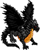
Sorry I haven't been able to get back here for a couple days, have had a busy schedule recently. I'll work on the shield, but here are a few new sprites. Some I did from scratch, others mostly from scratch, and some (like the peasant) I only modified slightly. For some reason, I had a sudden urge to lean towards the extra-terrestial side of things recently.
- Attachments
-
- Untitled-1.png (27.36 KiB) Viewed 3108 times
"I'm never wrong. One time I thought I was wrong, but I was mistaken."
-
Captain_Wrathbow

- Posts: 1664
- Joined: June 30th, 2009, 2:03 pm
- Location: Guardia
Re: artisticdude's sprites (critique welcome)
You posted it twice by accident. 
My quick overview:
The thing on the top reminds me of that billowing darkness (or whatever it's called) unit from the Nightmares of Meloen faction. (but I think your thing is better)
No comment on the peasant or the WC spearman.
The flag on of the dwarf's helmet looks flat, and something's just not right about the texture on his right arm.
Not really sure what the polka-dotted tentacle pot is supposed to be, but it looks interesting.
I love that shield on the orcish spearman, but all in all, that sprite seems a little small. Maybe it's just me.
The golden knight dude is a good idea, but the gold lining makes it look like his shield and his chest have splits down the middle. Maybe it's just because of the light background on the forums. I bet it would look better in-game.
And I have to go now, so I don't have time to critique the rest right now.

Re: artisticdude's sprites (critique welcome)
These are good, real good.
I think the peasants/ruffians scythe blade could use an outline, right now it doesn't match the rest of the sprite.
The gold lining needs work. Right now i makes the armor, somewhat straight and square. I think curving it more would do good.
That alien dud on the bottom right is awesome!
I think the peasants/ruffians scythe blade could use an outline, right now it doesn't match the rest of the sprite.
The gold lining needs work. Right now i makes the armor, somewhat straight and square. I think curving it more would do good.
That alien dud on the bottom right is awesome!
My spritework can be seen here.
Want to play Roll 2 Dodge, or even start your own game?http://rolltododge.freeforums.org/index.php We need you!
Want to play Roll 2 Dodge, or even start your own game?http://rolltododge.freeforums.org/index.php We need you!
-
artisticdude
- Moderator Emeritus
- Posts: 2424
- Joined: December 15th, 2009, 12:37 pm
- Location: Somewhere in the middle of everything
Re: artisticdude's sprites (critique welcome)
New batch, with some fixe-ups of the previous sprites. There's also a small thumbnail I did (not a portrait), which I was considering using for my avatar.
- Attachments
-
- new_and_fixed_old_sprites.png (30.76 KiB) Viewed 3000 times
"I'm never wrong. One time I thought I was wrong, but I was mistaken."

Re: artisticdude's sprites (critique welcome)
As a whole, most of the work you create yourself needs more contrast and shading.
I would suggest doing at least four shades for every color on a unit, unless it is very small or very dark.
I would suggest doing at least four shades for every color on a unit, unless it is very small or very dark.
-
artisticdude
- Moderator Emeritus
- Posts: 2424
- Joined: December 15th, 2009, 12:37 pm
- Location: Somewhere in the middle of everything
Re: artisticdude's sprites (critique welcome)
If you're referring to the lizard thing, I actually used close to 38 shades, but they were all very similar (only a tiny bit lighter/darker than the previous/next one). But I understand what you're saying, and will take it to heart. Less similar shades, more contrast. Thanks for the advice.Issyl wrote:I would suggest doing at least four shades for every color on a unit, unless it is very small or very dark.
"I'm never wrong. One time I thought I was wrong, but I was mistaken."
Re: artisticdude's sprites (critique welcome)
the lizard thing needs to get legs in the same perspective as the rest
Like cats? I've made a whole faction of them to kick ass with!
Don't like cats? I've made a whole faction of them to kick their asses! So everyone's happy :)
Felinian faction is part of the Beyond Southern Hells era
kitties need sprites! art topic here
Don't like cats? I've made a whole faction of them to kick their asses! So everyone's happy :)
Felinian faction is part of the Beyond Southern Hells era
kitties need sprites! art topic here
Re: artisticdude's sprites (critique welcome)
The dwarf's mail needs work, it looks simply like a flat texture. The Ent is cool
My spritework can be seen here.
Want to play Roll 2 Dodge, or even start your own game?http://rolltododge.freeforums.org/index.php We need you!
Want to play Roll 2 Dodge, or even start your own game?http://rolltododge.freeforums.org/index.php We need you!
Re: artisticdude's sprites (critique welcome)
The lizard, and also the armor on the skeletons, looks pillow shaded. Also, you don't really need 38 shades, 2 shades work better than millions as long as you put them in the right place.
-
artisticdude
- Moderator Emeritus
- Posts: 2424
- Joined: December 15th, 2009, 12:37 pm
- Location: Somewhere in the middle of everything
Re: artisticdude's sprites (critique welcome)
Thanks for the link AI, I understand about pillow shading now. But the anatomy of the lizard thing is all wrong, so I think I'll start over from scratch. 
Working on a new line of armored units based on my golden knight from my previous post. I've included two versions of the 'grand marshal,' which do you think is better? I also made two versions of a spirit sprite created all from scratch except for the face. There's a missile frame in there I'm sure someone can use somewhere... <.< >.>
Working on a new line of armored units based on my golden knight from my previous post. I've included two versions of the 'grand marshal,' which do you think is better? I also made two versions of a spirit sprite created all from scratch except for the face. There's a missile frame in there I'm sure someone can use somewhere... <.< >.>
- Attachments
-
- new sprites.png (19.03 KiB) Viewed 2883 times
"I'm never wrong. One time I thought I was wrong, but I was mistaken."
-
Captain_Wrathbow
- Posts: 1664
- Joined: June 30th, 2009, 2:03 pm
- Location: Guardia
Re: artisticdude's sprites (critique welcome)
The ghost things are incredible! I love those!
I'd say the bottom Grand Marshal is better. The top one looks like he has bunny ears.
On the guy to the right of the bunny marshal, the hilt of the sword seems too long... and that pose looks great and dramatic, but it looks like it would be extremely uncomfortable to stand like that for a long period of time.
All in all, great work. You're really churning out a lot of pretty good sprites very quickly!
Re: artisticdude's sprites (critique welcome)
Bottom right looks pillowed, in real life armor doesn't curve on all sides like that. also the dude on the right has no highlights or shadows, just the same pattern making him look very flat.
The skeletons are awesome as are the others. The second from the left guy still needs the improvement on the gold lining as i mentioned earlier.
Aside from that, these are looking good!
The skeletons are awesome as are the others. The second from the left guy still needs the improvement on the gold lining as i mentioned earlier.
Aside from that, these are looking good!
My spritework can be seen here.
Want to play Roll 2 Dodge, or even start your own game?http://rolltododge.freeforums.org/index.php We need you!
Want to play Roll 2 Dodge, or even start your own game?http://rolltododge.freeforums.org/index.php We need you!
-
artisticdude
- Moderator Emeritus
- Posts: 2424
- Joined: December 15th, 2009, 12:37 pm
- Location: Somewhere in the middle of everything
Re: artisticdude's sprites (critique welcome)
Only two sprites this time around, but I've also made a rough portrait (I know the helmet is blurry- this is still a WIP. If I could get some critique on the general form/anatomy that'd be great. I also included a cauldron and a little brown pot if anyone wants to use them, as well as a super saurian warrior and a... wild green sarlac? I don't really know what to call it. 
- Attachments
-
- THE POT.png (4.09 KiB) Viewed 2811 times
-
- soldierportrait.png (66.46 KiB) Viewed 2811 times
-
- thelittlebrownpot.png (3 KiB) Viewed 2811 times
-
- supersaurianwithloincloth.png (4.21 KiB) Viewed 2811 times
-
- wildgreensarlac.png (4.24 KiB) Viewed 2811 times
"I'm never wrong. One time I thought I was wrong, but I was mistaken."
-
artisticdude
- Moderator Emeritus
- Posts: 2424
- Joined: December 15th, 2009, 12:37 pm
- Location: Somewhere in the middle of everything
Re: artisticdude's sprites (critique welcome)
And here is a .zip with two pieces of story art created using my 3d program, maybe UMC authors could use them somewhere...
- Attachments
-
 Two Story Arts or whatever the proper plural form would be.zip
- (1.04 MiB) Downloaded 235 times
"I'm never wrong. One time I thought I was wrong, but I was mistaken."
-
artisticdude
- Moderator Emeritus
- Posts: 2424
- Joined: December 15th, 2009, 12:37 pm
- Location: Somewhere in the middle of everything
Re: artisticdude's sprites (critique welcome)
Here we go, a giant! A heavily armored brute capable of taking out three men with one swing of his massive axe...
- Attachments
-
- Giant.png (5.46 KiB) Viewed 2759 times
"I'm never wrong. One time I thought I was wrong, but I was mistaken."