Mefisto in vegetative state
Moderator: Forum Moderators
Forum rules
Before posting critique in this forum, you must read the following thread:
Before posting critique in this forum, you must read the following thread:

Re: Some sketches
Nice! The tropical forest looks really good although I think they still need some work. The trees sort of blend into each other making it hard to tell them apart, but I can't really say what's the technical cause of that. Anyway, when you finish that I'd say it should replace the current tropical forest, and the palms-only version should become a new terrain: IIRC the vast majority of uses of the tropical forest in mainline are actually trying to represent a temperate rainforest instead of palm trees on a beach.
-
homunculus

- Posts: 537
- Joined: July 21st, 2010, 9:47 pm
Re: Some sketches
like doofus-01 pointed out, the bright pixels look as if there was snow on the trunks.
but also, i would say that the leaves are difficult to interpret.
if you want it more sarcastically, i could also say:less contrast might probably help, but actually i think the palm leaves might be easier to interpret if maybe just two similar shades of green were used for the right and left half of the leaf.
as the leaves are curved, maybe those two shades of green would transition into darker and lighter shades over the length of the leaf depending on the local angle to the light direction.
or maybe such geometric interpretation oriented approach would look too cartoony.
as for the trunks, it looks like there is also "some" saturation there.
i think i read earlier in this thread that you were attempting coconut palms (which unfortunately implies bit less variety than in the old terrain).
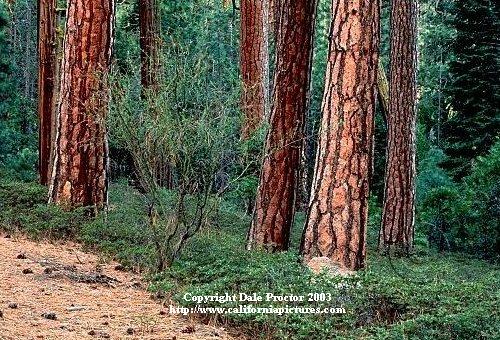
atm it looks like trunks of pine trees, like in this oversaturated picture of pine trunks, rather than coconut trunks.
as you can see, coconut trunks are really light blue (ok, they are almost gray).
that is, of course, from my understanding of attempting realism.
maybe you want palms with bright brown trunks.
or maybe it is about the color settings of your monitor which i think i remember you were complaining about.
but also, i would say that the leaves are difficult to interpret.
if you want it more sarcastically, i could also say:
Spoiler:
as the leaves are curved, maybe those two shades of green would transition into darker and lighter shades over the length of the leaf depending on the local angle to the light direction.
or maybe such geometric interpretation oriented approach would look too cartoony.
as for the trunks, it looks like there is also "some" saturation there.
i think i read earlier in this thread that you were attempting coconut palms (which unfortunately implies bit less variety than in the old terrain).
atm it looks like trunks of pine trees, like in this oversaturated picture of pine trunks, rather than coconut trunks.
as you can see, coconut trunks are really light blue (ok, they are almost gray).
that is, of course, from my understanding of attempting realism.
maybe you want palms with bright brown trunks.
or maybe it is about the color settings of your monitor which i think i remember you were complaining about.
-
Eleazar

- Retired Terrain Art Director
- Posts: 2481
- Joined: July 16th, 2004, 1:47 am
- Location: US Midwest
- Contact:
Re: Some sketches
It's a promising start. There's definitely room for a "jungle" terrain that's not of the desert island type.Mefisto wrote:I'm not so fond of these crazy colours anymore. They are too saturated indeed. I'm going to work on it . Now I'm doing experiments with editor. I replaced original tropical forest with mine in fifth scenario of HTTT. It looks quite well for me. Maybe I should get rid of blue tint on palm trees. In 1.8.5 I used different tiles: working name of this dense jungle is "green hell" and this is going to be a different, very harsh type of environment. In 1.9.1 I put sparse forest with more palms. I would appreciate comments.
Granted the current palm trees lack contrast, but if you want these to be mainline or look their best with mainline you are way overcompensating in the contrast/saturation department. It looks like you are either painstakingly recreating the pixelart appearance of the old days of when only a small number of colors could be displayed at once -- or else are saving the files with some compressed palette. Your palm trees are worse in this respect that your jungle. Anyway, it's not advisable for terrain. Super-dark shadows and super-bright highlights should be used sparingly if at all on terrain. Also there's no need to use a hard-edged brush all the time, especially on shadows.
Feel free to PM me if you start a new terrain oriented thread. It's easy for me to miss them among all the other art threads.
-> What i might be working on
Attempting Lucidity
-> What i might be working on
Attempting Lucidity
Re: Some sketches
Thanks for answers. My problems with monitor have ended some time ago. I have LCD screen in my laptop and LCD monitor at work which display colour in similar way so I can compare hue and saturation of my my work on different computers.
My palm trees were the first and it can be seen that they need improvement. The big trees of rainforest came next and were enhanced many times before I posted the picture with them. I know that they still require work. My goal is to make graphic for my campaign which takes place in tropical environment and partially on the sea - so I need also graphics for plant growing on atols. Of course I want them to be as good as possible. If they are by any chance accepted into mainline, it would be great but I have no such aspirations yet.
I'm going to revise the look of palm trunks and shadows and then I'll try to enhance more the foliage on rainforest trees so it wouldn't look like a mess but would be still clearly distinguishable from deciduous trees.
Re: Some sketches
Double post 
Palm variants improved. Background taken from 1.9.1.
Palm variants improved. Background taken from 1.9.1.
- Attachments
-
- palms-sand.png (105.43 KiB) Viewed 4356 times
-
- palms-grass.png (105.09 KiB) Viewed 4356 times
-
- palms-dirt.png (98.44 KiB) Viewed 4356 times
-
Sgt. Groovy

- Art Contributor
- Posts: 1471
- Joined: May 22nd, 2006, 9:15 pm
- Location: Helsinki
Re: Some sketches
The green highlights look over-saturated, giving a glow-in-the-dark vibe, especially against darker background.
Tiedäthän kuinka pelataan.
Tiedäthän, vihtahousua vastaan.
Tiedäthän, solmu kravatin, se kantaa niin synnit
kuin syntien tekijätkin.
Tiedäthän, vihtahousua vastaan.
Tiedäthän, solmu kravatin, se kantaa niin synnit
kuin syntien tekijätkin.
Re: Some sketches
This will be changed. I'm still enhancing single plant icons that build the forest. BTW, I have two questions. While examining "forest" graphic I noticed that there are only four variants of each type of forest. Is this the official rule or just artists stated that four gives enough diversity? I also spotted that there are "small" variants of forests, at least there is a "small variant" of original tropical forest. And in *.cfg files it is stated that "small" tile is adjacent to castle etc. Wha this small variant exactly mean? More sparse distribution of plants? Special placement? The size of image is the same as of four regular variants: 144x144 px.
Re: Some sketches
I don't think 4 is a hard rules, it's probably because it's suffciant for variability
as for the -small variation, it's to avoid graphic artifacts when the forest is next to a tile where overlapping would look weird. the -small variations fit in their hexes, the other ones don't
as for the -small variation, it's to avoid graphic artifacts when the forest is next to a tile where overlapping would look weird. the -small variations fit in their hexes, the other ones don't
Fight key loggers: write some perl using vim
Re: Some sketches
Thanks for info. I'll try to upload something soon.
Re: Some sketches
Hello, I'm still alive. I took some rest from Wesnoth. In meanwhile I've been learning pixelart. The kraken is still in his craddle, besides I'm going to redo him. I returned to my Wose drawing and once again tried to make proper shading. Here is the result:
- Attachments
-
- Abnormal_Bonsai.png (385.78 KiB) Viewed 4147 times
-
Sgt. Groovy
- Art Contributor
- Posts: 1471
- Joined: May 22nd, 2006, 9:15 pm
- Location: Helsinki
Re: Some sketches
Very nice, but I'd bring out the face and the hands just a little bit, to make clear it's a wose and not a tree.
Tiedäthän kuinka pelataan.
Tiedäthän, vihtahousua vastaan.
Tiedäthän, solmu kravatin, se kantaa niin synnit
kuin syntien tekijätkin.
Tiedäthän, vihtahousua vastaan.
Tiedäthän, solmu kravatin, se kantaa niin synnit
kuin syntien tekijätkin.
-
beetlenaut

- Developer
- Posts: 2825
- Joined: December 8th, 2007, 3:21 am
- Location: Washington State
- Contact:
Re: Some sketches
I agree with Sgt. Groovy. I thought it was a tree at first. (It's been a while since the previous version!) It would probably help if one of the hands was gesturing so you could see the fingers. With just a little work, I think it could go into mainline as an alternate. It's more sinister than the current portrait, so it would work really well when the wose on the enemy side.
Campaigns: Dead Water,
The Founding of Borstep,
Secrets of the Ancients,
and WML Guide
The Founding of Borstep,
Secrets of the Ancients,
and WML Guide
Re: Some sketches
Thanks. I'll tweak it some more. The main goal was accomplished as nobody is complaining about the shading of the trunk and canopy. When I finish kraken I'll probably try to draw more woses in style more similar to this of LordBob.
Re: Some sketches
I have begun to make sprites for my faction for my designed campaign. My inspiration is ancient egypt and ancient crete. First sprites, rather placeholders because they are rip-offs from Jetrels elf lady. These are variants of tropical princess. The prince will also be made in minoan fashion.
- Attachments
-
- princesses.png (5.04 KiB) Viewed 3885 times
Re: Some sketches
The dresses look cut-off at the bottom, they end with a straight horizontal line.
Also: boobies. ^^
Also: boobies. ^^
ride on shooting star