Woodmouse's art stuff [random stuff, page 49]
Moderator: Forum Moderators
Forum rules
Before posting critique in this forum, you must read the following thread:
Before posting critique in this forum, you must read the following thread:

Re: Woodmouse's sprites
xer...

I know my sprites aren't perfect. And I myself like them, and I think that's the most important thing. I'll read that, but you could have said what you think went wrong in the sprite?
I know my sprites aren't perfect. And I myself like them, and I think that's the most important thing. I'll read that, but you could have said what you think went wrong in the sprite?
Check out my sprites!

Re: Woodmouse's sprites
If you like them then there is nothing to fix. But if you don't like it then there must be something to fix in it. I personally don't like my sprites and none of them are completed, imo. It is all about the way you want to work.woodmouse wrote:xer...
I know my sprites aren't perfect. And I myself like them, and I think that's the most important thing. I'll read that, but you could have said what you think went wrong in the sprite?
Re: Woodmouse's sprites
Well, I like my sprites, and I don't feel like they're finished. I'll finish the best ones, maybe. Now I'm making a Wizard I like the most, and I'll post it when it's finished.
EDIT:
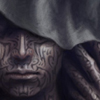
The Wizard is here! C&C?

EDIT:
The Wizard is here! C&C?
Check out my sprites!
-
thespaceinvader

- Retired Art Director
- Posts: 8414
- Joined: August 25th, 2007, 10:12 am
- Location: Oxford, UK
- Contact:
Re: Woodmouse's sprites
You're definitely improving.
Some tips for this chap.
1: Darker outlines, particularly in shaded portions.
2: More contrast on the coat, particularly in terms of highlights.
3: Blend the beard in a little more, instead of giving it hard edges. It looks a little unnatural at present, since beards tend not to have ruler-straight edges...
I'd also probably move his hat to our left by... 3 or 4 pixels, since it's not centred at present.
http://thespaceinvader.co.uk | http://thespaceinvader.deviantart.com
Back to work. Current projects: Catching up on commits. Picking Meridia back up. Sprite animations, many and varied.
Back to work. Current projects: Catching up on commits. Picking Meridia back up. Sprite animations, many and varied.
Re: Woodmouse's sprites
Thanks for the tips. 
I tried to fix those things.

C&C?
I tried to fix those things.
C&C?
Check out my sprites!
-
thespaceinvader
- Retired Art Director
- Posts: 8414
- Joined: August 25th, 2007, 10:12 am
- Location: Oxford, UK
- Contact:
Re: Woodmouse's sprites
I actually meant the TOP edge of the beard where it meets his face. The bottom was pretty good.
And in fixing that, you'#ve annihilated a lot of the contrast on the beard.
And in fixing that, you'#ve annihilated a lot of the contrast on the beard.
http://thespaceinvader.co.uk | http://thespaceinvader.deviantart.com
Back to work. Current projects: Catching up on commits. Picking Meridia back up. Sprite animations, many and varied.
Back to work. Current projects: Catching up on commits. Picking Meridia back up. Sprite animations, many and varied.
Re: Woodmouse's sprites
Oh. 
Well, the "contrast annihilation" is on purpose, because I thought it'd look more natural and realistic.
Anyway, I hope this is better?

Well, the "contrast annihilation" is on purpose, because I thought it'd look more natural and realistic.
Anyway, I hope this is better?
Check out my sprites!
-
SouthernOracle
- Posts: 82
- Joined: August 9th, 2008, 6:02 pm
- Location: Santa Monica, CA
Re: Woodmouse's sprites
I haven't seen all of your sprites, but this appears to be the best so far. And you've adjusted to the crits very well too.  IMO the hat looks a little large and misshapen - it appears to be the size of his torso and head combined. Although I've seen hats that large, it would seen uncomfortable and inconvenient.

Re: Woodmouse's sprites
Hey, I just want to say that I am impressed by the amount of improvements you're making.woodmouse wrote:Oh.
Well, the "contrast annihilation" is on purpose, because I thought it'd look more natural and realistic.
Anyway, I hope this is better?
There is still room for improvement, as others will be able to describe better, but you've clearly taken a large step in your art creation! If you can keep up this pace of improvement by continuing to practice and listen to others' advice, who knows how good you will become!
Re: Woodmouse's sprites
Thanks, SouthernOracle and JW!
I know the hat is too big, but that's on purpose. He's a medievalish Wizard, so he has to have a big hat.
Does anyone have ideas for a medievalish sprite? Or how to better the Wizard?
I know the hat is too big, but that's on purpose. He's a medievalish Wizard, so he has to have a big hat.
Does anyone have ideas for a medievalish sprite? Or how to better the Wizard?
Check out my sprites!
-
Skizzaltix
- Posts: 1114
- Joined: December 9th, 2005, 2:38 am
Re: Woodmouse's sprites
Haha, that hat rocks 
I think you should probably try to pay a little more attention to form and balance, though--he looks a little bit like he's going to fall over backwards. Also, I'm not really getting a sense of what shape his body is; almost as if he were a cardboard cutout
I'm a pretty lousy pixel-artist, though, so I don't know how you'd fix it, unfortunately...
Re: Woodmouse's sprites
Hmm... I'm afraid I don't know how to fix the "falling backwards" thing, because I don't see it like that.  But if someone knows, please tell.
But the body is like... a normal body lol. I mean, the arms aren't visible, neither the feet, but they exist.
But the body is like... a normal body lol. I mean, the arms aren't visible, neither the feet, but they exist.
Check out my sprites!

Re: Woodmouse's sprites
What he is trying to say is that the feet, even though they cannot be seen, seem to be in front of the body when you follow the lines of the legs to where they would be. The hips and chest seem to be behind the feet a bit and then the head further back, making it seem as if the body is falling away from the viewer.
Mainline Maintainer: AOI, DM, NR, TB and THoT.
UMC Maintainer: Forward They Cried, A Few Logs, A Few More Logs, Start of the War, and Battle Against Time
UMC Maintainer: Forward They Cried, A Few Logs, A Few More Logs, Start of the War, and Battle Against Time
Re: Woodmouse's sprites
Hmm, so should I make it like... move the head and torso to the right?
Check out my sprites!
Re: Woodmouse's sprites
That would help a little bit, but it's also in how the legs are drawn. You can follow the lines on the pants and see that he seems to be bent at his knees for some reason instead of standing up straight.
Mainline Maintainer: AOI, DM, NR, TB and THoT.
UMC Maintainer: Forward They Cried, A Few Logs, A Few More Logs, Start of the War, and Battle Against Time
UMC Maintainer: Forward They Cried, A Few Logs, A Few More Logs, Start of the War, and Battle Against Time