Artwork for Children of Dragons
Moderator: Forum Moderators
Forum rules
Before posting critique in this forum, you must read the following thread:
Before posting critique in this forum, you must read the following thread:
-
thespaceinvader

- Retired Art Director
- Posts: 8414
- Joined: August 25th, 2007, 10:12 am
- Location: Oxford, UK
- Contact:
Re: Artwork for Children of Dragons
Bah. There's a thread with all the images somewhere in the closed art dev section. Not sure whether neo's still working on them, though.
http://thespaceinvader.co.uk | http://thespaceinvader.deviantart.com
Back to work. Current projects: Catching up on commits. Picking Meridia back up. Sprite animations, many and varied.
Back to work. Current projects: Catching up on commits. Picking Meridia back up. Sprite animations, many and varied.

Re: Artwork for Children of Dragons
I think it was last posted in on the somethingth of jully, not sure though, get a linky in a second.
[edit]
http://www.wesnoth.org/forum/viewtopic. ... &sk=t&sd=a
Last post on the 29th of October
[/edit]
[edit]
http://www.wesnoth.org/forum/viewtopic. ... &sk=t&sd=a
Last post on the 29th of October
[/edit]
Re: Artwork for Children of Dragons
ok, so that means that not much can be done with the drakes until neo wants to finish them.
The more you know...
Anyways I asked someone in rl what they thought and she said that I practically have created a new picture by the time I breath in then out. So here is next one.
I'm probably going a bit too fast with these... oh well.
The more you know...
Anyways I asked someone in rl what they thought and she said that I practically have created a new picture by the time I breath in then out. So here is next one.
I'm probably going a bit too fast with these... oh well.
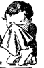
Bawling Little Man...
Re: Artwork for Children of Dragons
next one is done.
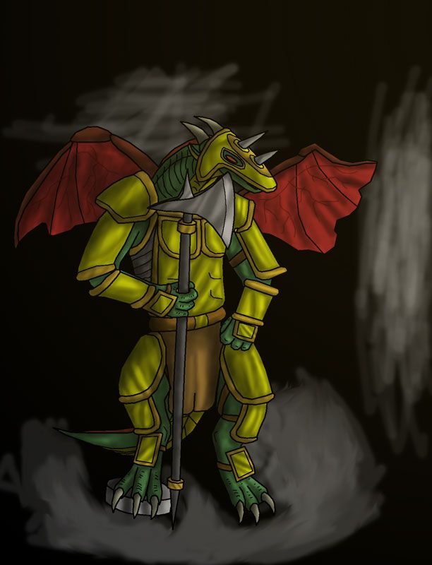
version 2 of the Gakk picture. Gakk is a good way to describe how I fell about this one...
version 2 of the Gakk picture. Gakk is a good way to describe how I fell about this one...
Bawling Little Man...
Re: Artwork for Children of Dragons
Just back again to show more of the same...
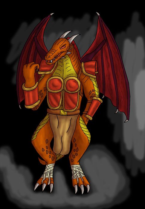
Flerk v2. the stances to seem to suffer from a lack of balance and the hands still look odd.
its ugly
Flerk v2. the stances to seem to suffer from a lack of balance and the hands still look odd.
its ugly
Last edited by BLM on April 14th, 2008, 8:02 am, edited 1 time in total.
Bawling Little Man...
-
Girgistian

- Art Contributor
- Posts: 668
- Joined: April 5th, 2008, 8:23 pm
- Location: The lands of perkele
Re: Artwork for Children of Dragons
The stance looks odd probably because the toes, knees and ankles bend very little, and the claws of the feet point too much down. Also, the left arm is too long (I think you mentioned about it before) and the left hand's thumb is on the wrong side. The other fingers probably point too much to the right, it kind of looks like they they're bent someway. Otherwise, this has potential.
And about the head too... The snout is leaning away from the viewer, while the forehead leans towards the viewer. This makes the head look as if it's twisted somehow. Keep on practicing and it'll be great.
And about the head too... The snout is leaning away from the viewer, while the forehead leans towards the viewer. This makes the head look as if it's twisted somehow. Keep on practicing and it'll be great.
For the dark gods!
-
Girgistian
- Art Contributor
- Posts: 668
- Joined: April 5th, 2008, 8:23 pm
- Location: The lands of perkele
Re: Artwork for Children of Dragons
Also, I have something of my own to contribute for the campaign.
- Attachments
-
For the dark gods!
Re: Artwork for Children of Dragons
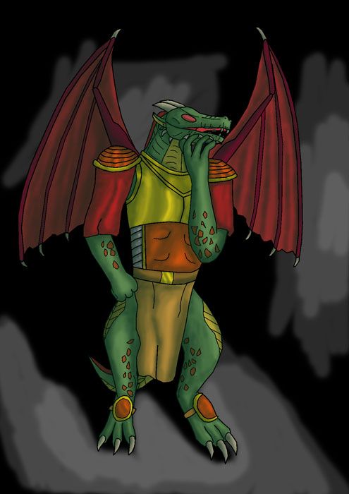
Wow, a 4MP image. That's an amazing amount of detail, yet it still looks a bit flat. I think this is because while the scales themselves are shaded, the 'skin' they make up isn't. (the details are shaded, but the big picture isn't)
Re: Artwork for Children of Dragons
Lol its been hijacked. Anyways my plan was to take all my simpler drawings so far and piece them together in a larger picture, so I'd have a bunch of smaller less detailed portraits in larger more detailed setting. This why I did not really put much effort into the backgrounds. The plan was to have this be the council. Then I was also going to redo the fight scene, make a splash image, and complete anything else that might have needed to be done. However, my drawings are still problematic, indicating that I should have probably spent a little more time on then.
The portrait looks good to me, the neck seem a bit small though and looks odd at the point where it comes out of the clothing. This is probably because there are no skin shadows, just ambient light. However there are shadows and highlights on the armor, indicating that there is a source of lighting that apparently does not affect the skin. Also the swords seems smugged near the hilt.
The portrait looks good to me, the neck seem a bit small though and looks odd at the point where it comes out of the clothing. This is probably because there are no skin shadows, just ambient light. However there are shadows and highlights on the armor, indicating that there is a source of lighting that apparently does not affect the skin. Also the swords seems smugged near the hilt.
Bawling Little Man...
Re: Artwork for Children of Dragons
I really should not have, but sometimes I can't help myself.
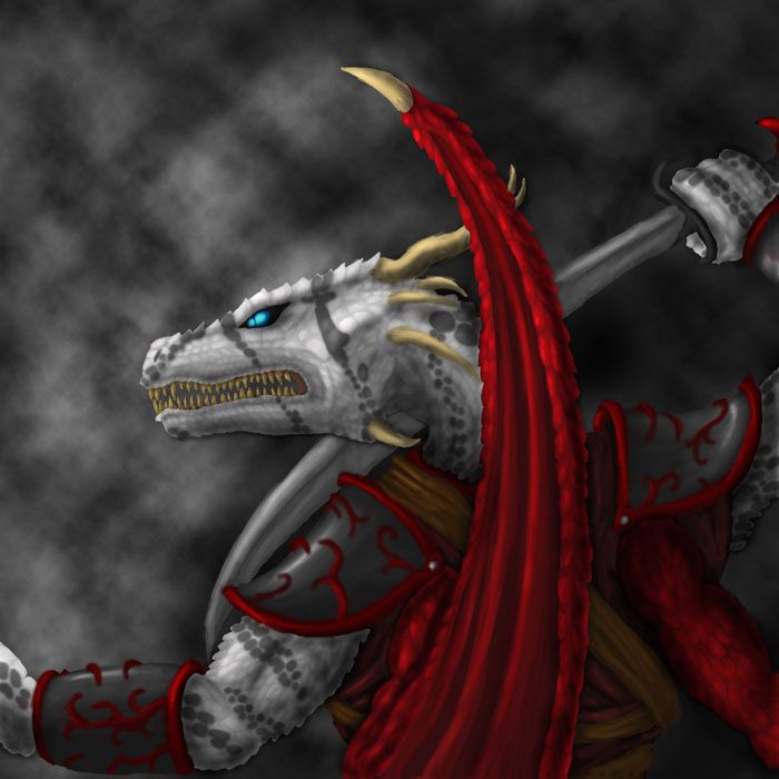
sorry...
also his wing is coming out of his deltoid region, the sword is beginning to look odd going across his neck, and the fore arm seems short...
Still a very nice picture.
sorry...
also his wing is coming out of his deltoid region, the sword is beginning to look odd going across his neck, and the fore arm seems short...
Still a very nice picture.
Bawling Little Man...
-
Girgistian
- Art Contributor
- Posts: 668
- Joined: April 5th, 2008, 8:23 pm
- Location: The lands of perkele
Re: Artwork for Children of Dragons
This does look better. I didn't have the energy to finish the lightning, since I got this ready at around 2 am, but at least someone apparently did.
Last edited by Girgistian on April 17th, 2008, 6:45 pm, edited 1 time in total.
For the dark gods!

Re: Artwork for Children of Dragons
Yes, the picture is very nice and detailed, and the shadowing you made its also very good, I like the volume sensation.BLM wrote:also his wing is coming out of his deltoid region, the sword is beginning to look odd going across his neck, and the fore arm seems short...
Still a very nice picture.
As a note for the artist, the sword as the character is holding doesn't make much sense, you usually don't place the sword in fron of your body just in case you don't block the blow with strenght enough and get chopped by your own blade.
I suppose you aimed to have the sword be hold over the character head and pointed forward to the enemy, buth tha blade'ss point is placed too low, it probably would look more natural if the sword blade is placed in an angle similar to the horns of the drake or slighty below/high.
Sorry but english isn't my main lenguage.
some images to try to adress my point.
Sword blade should be at the same angle that her left hand
another one
"Mysteries are revealed in the light of reason."
-
Girgistian
- Art Contributor
- Posts: 668
- Joined: April 5th, 2008, 8:23 pm
- Location: The lands of perkele
Re: Artwork for Children of Dragons
Yeah, the blade could be a bit higher. The pictures you have, however, represent a stance where one would thrust, while the stance the drake has would - I think - be more suitable for a swing from a downward diagonal angle. That was the original purpose, at least. It might be a little bit higher though, I admit, but the sword in the pictures differs a lot from the scimitar the drake is wielding. Thus, it is used for different sort of strikes, so it doesn't matter that much. Except for the fact that it's too close to the body. I'm not going to bother to fix this though.
For the dark gods!
Re: Artwork for Children of Dragons
the stance was more a look at the angle of the weapon rather than about thrusting weapon features.
I suppose that the weapon these hulks use would be more similar to this one however.
Yinfu-dao
bagua-dao2
some postures with more weapons
Yet other more
As you can see, its a slashing weapon but the angle is more similar, since from the position you gived to the drake's hand, the only way to rotate the sword for the swing motion (and the attack get any potence) would need to pass over the drake head to do a "full circle".
From the actual position, the drake would behead himself if he tries to do a side swing. Or that is my impression.
However, I'm not the artist, and only made a suggestion on the draw. I'm glad to see a nice draw of a drake with such detail.
"Mysteries are revealed in the light of reason."
-
Girgistian
- Art Contributor
- Posts: 668
- Joined: April 5th, 2008, 8:23 pm
- Location: The lands of perkele
Re: Artwork for Children of Dragons
Yes, and as I said, the weapon is too close to the body, which is why it would seem he'd most likely just slit his throat while swinging it. I'm still not going to bother to try and fix it, since I don't want to go through the hell of making the scales again, and I don't really care about it so much. But thanks for pointing that out anyway.
For the dark gods!