Artwork for Children of Dragons
Moderator: Forum Moderators
Forum rules
Before posting critique in this forum, you must read the following thread:
Before posting critique in this forum, you must read the following thread:
Artwork for Children of Dragons
BLM has offered to start doing custom artwork for my Drakes campaign, Children of Dragons - so I figured I'd create an official thread here. 
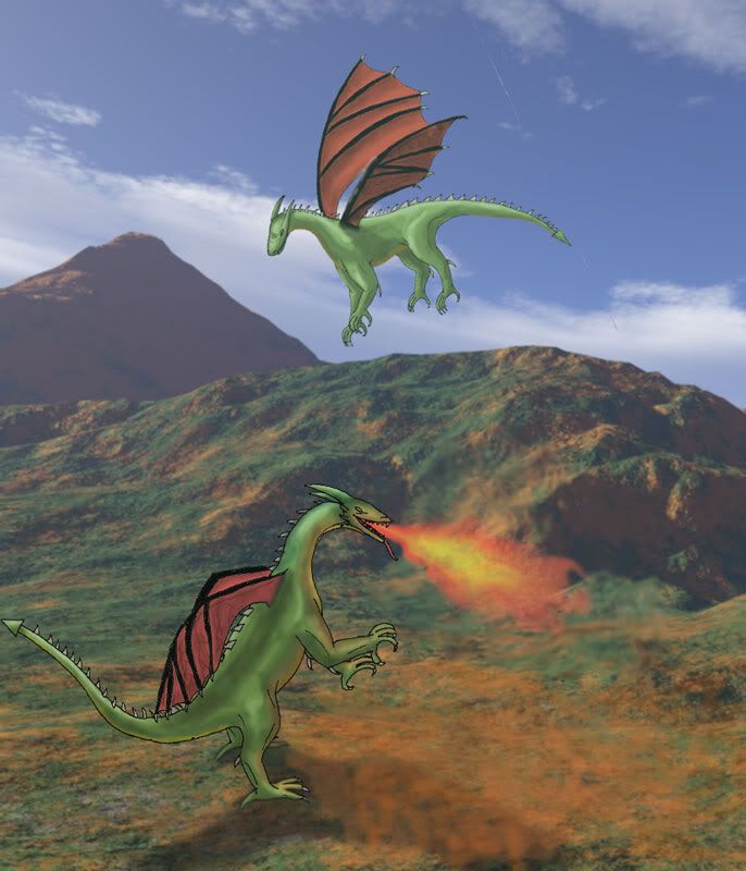
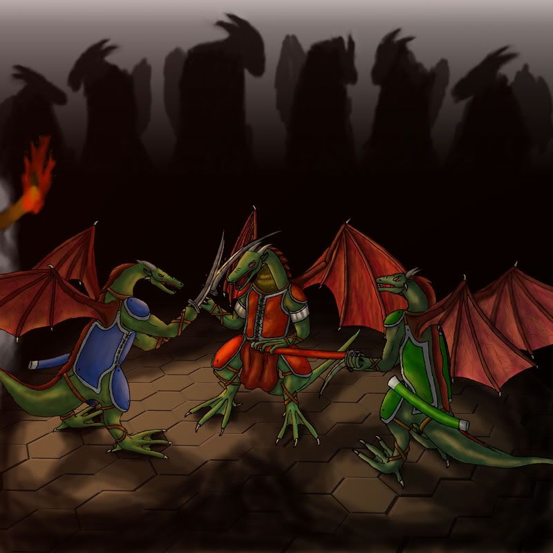
Here is what he's done so far:
And some portraits:
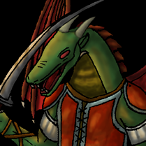
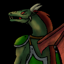
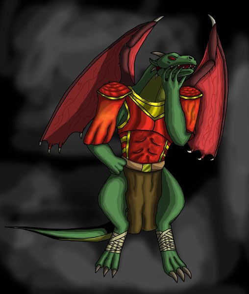
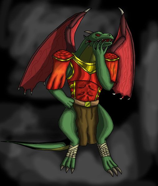
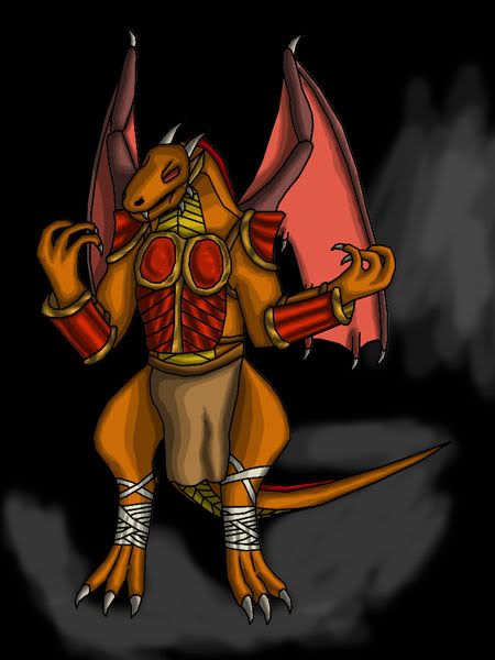
Kahn:
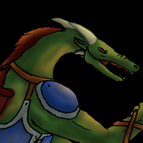
Verk:
Garaag:
Here is what he's done so far:
And some portraits:
Kahn:
Verk:
Garaag:
This signature intentionally left blank.

Re: Artwork for Children of Dragons
Well it is slightly embarrassing to have mark start this thread for me when they are my pictures  . I feel like such a n00b
  .
.
Anyways I'm here to screw up the drakes even worse than they already are by drawing pictures for mark's campaign.
Let me know what you think!
Anyways I'm here to screw up the drakes even worse than they already are by drawing pictures for mark's campaign.
Let me know what you think!
Bawling Little Man...
Re: Artwork for Children of Dragons
I think they are grand!BLM wrote:Well it is slightly embarrassing to have mark start this thread for me when they are my pictures
Anyways I'm here to screw up the drakes even worse than they already are by drawing pictures for mark's campaign.
Let me know what you think!
-
thespaceinvader

- Retired Art Director
- Posts: 8414
- Joined: August 25th, 2007, 10:12 am
- Location: Oxford, UK
- Contact:
Re: Artwork for Children of Dragons
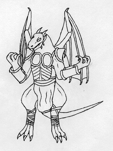
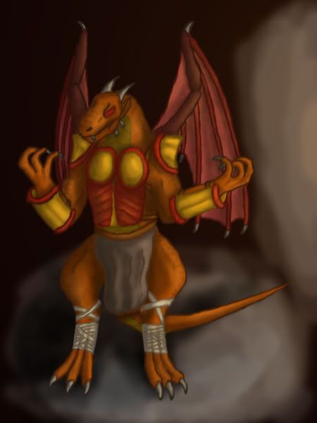
Not bad, but the wing attachments in particular need a bit of work - currently the wings just stop at the skin and don't appear to have any form of attachment or underlying bone structure/musculature that would allow them to actually work. You need to think about this kind of thing even in fantasy creatures, otherwise you end up with something that just doesn't look quite right. This tutorial might be of help to you. Overall, i think you need to think a bit harder about what's going on under the skin. But keep up the good work, you've got an eye for composition and colouring.
Also, what's the standing dragon shooting flame at in the first image? There doesn't seem to be anything there for it to breathe ON...
Also, what's the standing dragon shooting flame at in the first image? There doesn't seem to be anything there for it to breathe ON...
http://thespaceinvader.co.uk | http://thespaceinvader.deviantart.com
Back to work. Current projects: Catching up on commits. Picking Meridia back up. Sprite animations, many and varied.
Back to work. Current projects: Catching up on commits. Picking Meridia back up. Sprite animations, many and varied.
Re: Artwork for Children of Dragons
Maybe the dragon was just doing it for fun or it just woke up and it needed to re awaken its fire breathing like when we yawn in the morning.thespaceinvader wrote: Also, what's the standing dragon shooting flame at in the first image? There doesn't seem to be anything there for it to breathe ON...
Re: Artwork for Children of Dragons
Thanks all for the comments and suggestions. I have edited the middle one to make look more like they could actually fly with their wings. With as easy as the first one was to do, it could potentially be scraped and replaced. The biggest problems with the first one is where are they, what is their size, and what are they doing there. I see no problem with having the dragon belching fire onto nothing, although I admit that I was going to place in a burning house but got too lazy.
May have another to show by tonight.
May have another to show by tonight.
Last edited by BLM on March 26th, 2008, 5:52 pm, edited 1 time in total.
Bawling Little Man...
Re: Artwork for Children of Dragons
Ok, just finished a sketch of Gakk.
There are several things that I don't like about this one.
First the armor does not seem quite right.
The head looks kinda strange at that angle in that position.
Finally the actually drawing is under 3 in x 2 in, which in my opinion is too small.
I'm hoping that adding color will make the blemishes less noticeable, I have found that it normally does.
There is no such thing as the "perfect" picture, to me it is obvious that I still need improvement.
Bawling Little Man...
Re: Artwork for Children of Dragons
Just finish editing in photoshop elements 2.
My biggest drawback when it comes to photoshop is that I don't have a tablet.
That said, I feel that more could be done with this picture...it is not complete.
It probably looks too much like he is shrugging. Problem may be fixable.
Loin cloth's shadow is wrong. armor should probably be decorated...
Well thats it for now, let me know how bad it is.(also I know the floor shadow is off, just did not feel like fixing atm)
Am I showing any potential at all?
Bawling Little Man...
Re: Artwork for Children of Dragons
Not bad, not bad at all.BLM wrote:Just finish editing in photoshop elements 2.
My biggest drawback when it comes to photoshop is that I don't have a tablet.
That said, I feel that more could be done with this picture...it is not complete.
It probably looks too much like he is shrugging. Problem may be fixable.
Loin cloth's shadow is wrong. armor should probably be decorated...
Well thats it for now, let me know how bad it is.(also I know the floor shadow is off, just did not feel like fixing atm)
Am I showing any potential at all?

Re: Artwork for Children of Dragons
it looks like he's wearing a sack of potatoes... 
http://www.wesnoth.org/wiki/User:Sapient... "Looks like your skills saved us again. Uh, well at least, they saved Soarin's apple pie."
Re: Artwork for Children of Dragons
I think this image demonstrates potential. It's evident that you've worked out the overall proportions and that you grasp the way light should hit objects you shade. Also that you know how to split the image into parts and work on them individually.BLM wrote:Am I showing any potential at all?
I think you just need a lot of practice
I'd advise looking through http://www.wesnoth.org/wiki/External_Tutorials, and checking out anything you think you don't understand, or would like to work on. In particular I think you should practice cell shading techniques, I'll explain why:
In this image, you've taken the lines that you've drawn, and you've painted over and in between them. To blend the strokes together and make the surfaces look smooth, you've used a lot of smooth shading and soft lines. Unfortunately, this has the side-effect of making the whole image seem blurry and lumpy.
There are two things you could do that would fix this:
1) put in A LOT more detail. At this resolution, if you're aiming for realistic shading you should be able to make out individual scales on his skin. This would be a huge amount of work.
2) clean up all the edges to remove unnecessary detail in the lines, and shade in distinct gradations with fairly sharp edges. The shading on Jormungandr's current drake portraits is a fairly good example, and in fact I think this might be the effect you would like to achieve. An example is the lines on the wings of your drake. They have a lot of kinks and wobbles in them that shouldn't really be there. The shading suffers from the same problem.
It is quite hard to make clean lines without a tablet, but it isn't impossible
Hope this helps.
Re: Artwork for Children of Dragons
It seem like mesilliac nailed down what sapient was hinting at. Thank you mesilliac, that was actually some of the best advise I have heard in awhile regarding art. Espreon thank you for being supportive so far. Here is a new picture named Flerk.
my own thoughts are that the arm is too big, the feet don't look like they are supporting weight, the head area is not defined enough, the hands look strange, and the cloth on the bloated arm does not look right.
I'm probably insane for doing this on a 600px X 800px monitor when better is available to me...oh well. Thanks for the input so far, keep it coming.
Bawling Little Man...

Re: Artwork for Children of Dragons
Heres an issue i see a lot in art: The hands have no palms. The fingers kinda grow right off the ends of the arms like funky tentacles. Make a palm/back of hand area on your hands and they'll look immensely better. You should also put some shadows originating at the feet.
You have much potential, and it is good that you have some doubts in your work as long as it drives you to improve. Happy drawing!
You have much potential, and it is good that you have some doubts in your work as long as it drives you to improve. Happy drawing!
Re: Artwork for Children of Dragons
This picture of flerk is very skewed to the right at the top.
If you flip the image horizontally (mirror it), you'll probably see what I mean. You should do this periodically as you work, too.
If you flip the image horizontally (mirror it), you'll probably see what I mean. You should do this periodically as you work, too.
Re: Artwork for Children of Dragons
Yep, so I went for a quick fix. here is the after pic for flerk.mesilliac wrote:This picture of flerk is very skewed to the right at the top.
Now it looks like he is leaning away.
Also went back to Gakk as I have suddenly had a style change.
here is the after pic.
This week I'm expecting to be busy with studies, so there may not be much more until next week.
Thanks for the comments and responses, I plan to continue when I find the time.
Bawling Little Man...