IT's Al_Raab Workspace
Moderator: Forum Moderators
Forum rules
Before posting critique in this forum, you must read the following thread:
Before posting critique in this forum, you must read the following thread:
-
IndieTrannie
- Posts: 39
- Joined: January 1st, 2008, 10:24 pm
IT's Al_Raab Workspace
HAI
CAN HAS Attention?
VISIBLE "Oh NOES! A Newbie arrives!"
KTHXBYE
Got into the game a little while ago, and am having a lot of fun with it so far. On a lark I decided to start making some units, one day I hope make an army, then an era, then a campaign, but no rush, just focusing on getting one little piece done at a time.
It isn't meant for the main Wesnoth cannon, instead for a story I'm kicking around in my head. Still I thought I'd get the art posted up and get some critiques on it.
This is an Angreal Spearman.
The wings aren't useful because the armor is too heavy.
It's meant to stand firm at the front lines, doing medium damage, 2-7 I was thinking, with first strike. Also relatively high HP 40-50 range, no ranged attacks.
I was thinking of making it level 1, does it seem correctly powered for that, or is it comparatively high?
It's origin is in the mountains so I was thinking mountains and plains being it's best terrain types. Water/Sand/Swamp being it's worst simply because of weight.
I'm interested in hearing artistically, if people prefer the soft border approach or the black borders.
- Attachments
-
- Main Stance, 52px x 35px
- AngrealSpearman.png (2.18 KiB) Viewed 4459 times
-
- Facing SW, 52px x 35px
- AngrealSpearmanSW.png (2.16 KiB) Viewed 4462 times
-
- Being Hit, 52px x 50px
- AngrealSpearmanSEHit.png (2.42 KiB) Viewed 4467 times
-
- A frame of idle using a soft border approach.
- AngrealSpearmanIdle1.png (2.49 KiB) Viewed 4463 times
Last edited by IndieTrannie on January 9th, 2008, 2:44 pm, edited 4 times in total.
-
thespaceinvader

- Retired Art Director
- Posts: 8414
- Joined: August 25th, 2007, 10:12 am
- Location: Oxford, UK
- Contact:
Harder, but not black, borders are preferred, as a rule, certainly in the mainline sprites. And personally, i agree. Without borders, sprites at this size tend to look a little fuzzy.
The sprites themselves are pretty good, but i think you might be rying to put a little too much detail into them. And what's an angreal?
The sprites themselves are pretty good, but i think you might be rying to put a little too much detail into them. And what's an angreal?
http://thespaceinvader.co.uk | http://thespaceinvader.deviantart.com
Back to work. Current projects: Catching up on commits. Picking Meridia back up. Sprite animations, many and varied.
Back to work. Current projects: Catching up on commits. Picking Meridia back up. Sprite animations, many and varied.
-
Aethaeryn

- Translator
- Posts: 1554
- Joined: September 15th, 2007, 10:21 pm
- Location: Baltimore, Maryland, USA
2-7? That's a lot of strikes for little damage. You may have it backwards, it's "damage-strikes" and the typical attack has more damage than strikes. 7-2 (or 7-3) might be better for you.
Aethaeryn (User Page)
Wiki Moderator (wiki)
Latin Translator [wiki=Latin Translation](wiki)[/wiki]
Maintainer of Thunderstone Era (wiki) and Aethaeryn's Maps [wiki=Aethaeryn's Maps](wiki)[/wiki]
Wiki Moderator (wiki)
Latin Translator [wiki=Latin Translation](wiki)[/wiki]
Maintainer of Thunderstone Era (wiki) and Aethaeryn's Maps [wiki=Aethaeryn's Maps](wiki)[/wiki]
-
IndieTrannie
- Posts: 39
- Joined: January 1st, 2008, 10:24 pm
Ahh, thanks Aethaeryn, I did indeed mean 2 strikes for 7 damage. 7-3 does make sense to me, since I noticed alot of level 1 units do roughly 20 damage in a perfect, no misses, attack.
I'm still not sure where I stand on the borders, but I'll try creating versions with varying borders and see how it goes. I actually kind of prefer the straight up non-black because it feels a bit anti-aliased, but it doesn't really go with the rest of the units in the game with their fairly dark borders. I'll probably go with dark borders for consistency, I'm just unsure of how well I'll be able to pull off the effect.
Is being over detailed making them too busy? It's hard to judge that well in your own work. I'll see if I can can change some things to be more implied, the stomach area is looking a bit too busy now that I think about it.
Glad you asked about the Angreal. Basically the Angreal are a winged race of mountain dwellers living high in the peaks of the [insert name when I come up with it] mountains. They foster a strong belief in the Sun God Ab-Raal, who their creation myth states placed them in the mountains in the first age. They make up over half the Holy Matre's, high priestess if you will, elite guard. They live side by side with the humans from the mountains foothills.
They are not expansionist, nor proselytes. They consider it their duty to protect their mountains and their religion. In the campaign storyline, the war is brought to them.
-
IndieTrannie
- Posts: 39
- Joined: January 1st, 2008, 10:24 pm
All right I tried a darker background style. From my in-game test, the borders are still softer than the usual, but it's not quite so glaring now.
Also I sketched up this possible advancement, then made a quick sprite. All hail the doorshield.
Also I sketched up this possible advancement, then made a quick sprite. All hail the doorshield.
- Attachments
-
- Semi-Bordered
- AngrealSpearmanIdle2v3.png (2.61 KiB) Viewed 4370 times
-
- 55px x 42px
- AngrealDefender.png (2.39 KiB) Viewed 4367 times
-
Sgt. Groovy

- Art Contributor
- Posts: 1471
- Joined: May 22nd, 2006, 9:15 pm
- Location: Helsinki
The defender looks like he has unhinged a door to be used as a shield.  Try making it a bit shorter (so that he can peek over it to see what he's defending against) and maybe a bit curved.
Tiedäthän kuinka pelataan.
Tiedäthän, vihtahousua vastaan.
Tiedäthän, solmu kravatin, se kantaa niin synnit
kuin syntien tekijätkin.
Tiedäthän, vihtahousua vastaan.
Tiedäthän, solmu kravatin, se kantaa niin synnit
kuin syntien tekijätkin.
-
thespaceinvader
- Retired Art Director
- Posts: 8414
- Joined: August 25th, 2007, 10:12 am
- Location: Oxford, UK
- Contact:
Yeah, that shield's a touch on the unrealistic side for use by a melee fighter. COuld turn into a crossbowman's pavisse quite easily, though... And on the same sprite, something's bugging me about the colouring on the skirt around his legs - you have very different saturations for the highlights and shades, and it looks quite odd. You shouldn't use too sharp a jump, there. The same's true elsewhere, but that's the place it's most obvious.
http://thespaceinvader.co.uk | http://thespaceinvader.deviantart.com
Back to work. Current projects: Catching up on commits. Picking Meridia back up. Sprite animations, many and varied.
Back to work. Current projects: Catching up on commits. Picking Meridia back up. Sprite animations, many and varied.
-
IndieTrannie
- Posts: 39
- Joined: January 1st, 2008, 10:24 pm
I've actually seen a door shield, their meant to be used in shield walls. Which gives me an idea for an ability if I ever feel like digging that deep into coding, but anyways... I changed it down to a simpler square heater shield after doing some more research.
Thanks for mentioning the saturation, it had totally escaped my notice, I'll look back over everything later and see where I've offended the worst. I know I've definitely been bad about it so far.
I made a couple new units, I used a mage for reference so hopefully they are slightly more similar to typical Westnoth units. I still retained some of my own style though, just wasn't totally comfortable with the standing angle of the mage.
Lastly a couple quick sketches of portrait ideas for the spearman. I'll link to my site since I don't want to kill anyones h-scroll with them as attachements.
400px wide, 100kb each.
http://www.thetagamerz.com/images/spearmanport1.png
http://www.thetagamerz.com/images/spearmanport2.png
Quick thought:
I was playtesting the spearman and had it at 9-2 with first strike, 50 hp, 45 xp, and move 5 with a cost of 22g. It was more powerful than the other first levels, but it still didn't seem to make a return on the investment. I'll have to see how it works with lower xp and a lower cost, but I'm open to any suggestions on how to balance it better.
- Attachments
-
- Fanatics - Fat guys with clubs.
- fanatic.png (1.62 KiB) Viewed 4316 times
-
- Mountain Clerics - Hard working mountain men that double as clergy... or is it the other way around?
- MountainCleric.png (2.19 KiB) Viewed 4311 times
-
- AngrealDefender.png (2.51 KiB) Viewed 4327 times
-
Shadow
- Posts: 1264
- Joined: September 9th, 2004, 10:27 am
- Location: Following the steps of Goethe
- Contact:
The sprites itself are not bad.
They are bit to big though and black outlines are a big no go.
For more infos about specifications.
Look here
or click though my sig for a tutorial I made. (Excuse the ad block )
)
They are bit to big though and black outlines are a big no go.
For more infos about specifications.
Look here
or click though my sig for a tutorial I made. (Excuse the ad block
... all romantics meet the same fate someday
Cynical and drunk and boring someone in some dark cafe ...
All good dreamers pass this way some day
Hidin’ behind bottles in dark cafes
Cynical and drunk and boring someone in some dark cafe ...
All good dreamers pass this way some day
Hidin’ behind bottles in dark cafes
-
thespaceinvader
- Retired Art Director
- Posts: 8414
- Joined: August 25th, 2007, 10:12 am
- Location: Oxford, UK
- Contact:
I can see real potential in those sketches - have you considered trying your hand at unit portraits and/or story artwork for the mainline game?
The sprites are looking good, but the proportions are a little off compared to the wesnoth standard - that's not drastically important in UMC, but they will look a little out of place when played against the mainline units. The saturation trouble from before seems to have abated, but the same skirt now has a big dark blob on the right leg - it looks like you've tried to put a crease there, but there shouldn't be one, in fact there should be a highlight, as on the other leg...
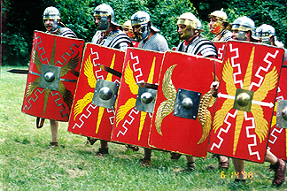
The biggest practical tower shield (not door shield as far as i know) i've come across, is the classic Roman one, which worked perfectly in shield walls and even more complex formations, most of which the romans either invented or perfected...
The sprites are looking good, but the proportions are a little off compared to the wesnoth standard - that's not drastically important in UMC, but they will look a little out of place when played against the mainline units. The saturation trouble from before seems to have abated, but the same skirt now has a big dark blob on the right leg - it looks like you've tried to put a crease there, but there shouldn't be one, in fact there should be a highlight, as on the other leg...
The biggest practical tower shield (not door shield as far as i know) i've come across, is the classic Roman one, which worked perfectly in shield walls and even more complex formations, most of which the romans either invented or perfected...
http://thespaceinvader.co.uk | http://thespaceinvader.deviantart.com
Back to work. Current projects: Catching up on commits. Picking Meridia back up. Sprite animations, many and varied.
Back to work. Current projects: Catching up on commits. Picking Meridia back up. Sprite animations, many and varied.
-
megane
- Art Contributor
- Posts: 410
- Joined: October 30th, 2006, 4:55 am
- Location: The Big Ö (a.k.a. Austria)
I think this is what they mean about the black borders; your outlines are sort of like the one on the left, while most Wesnoth sprites have outlines like the right.
You want the outline to be a darker, but not black, shade of the color it's surrounding; the fill here is %80 grey, so I used a %30 grey outline. This way, the outline can still be seen when against a dark background, and looks somewhat softer in general.
You want the outline to be a darker, but not black, shade of the color it's surrounding; the fill here is %80 grey, so I used a %30 grey outline. This way, the outline can still be seen when against a dark background, and looks somewhat softer in general.
- Attachments
-
- edges.png (407 Bytes) Viewed 4281 times
that little girl's parents were attacked by ninjas - generic npc
hee hee! - little girl
hee hee! - little girl
-
IndieTrannie
- Posts: 39
- Joined: January 1st, 2008, 10:24 pm
I'm a little burnt out on spriting just this second... so I'm gonna wait a bit on fixing those. I think you're kind of confirming what I was leaning towards on the borders, so I'll most likely be giving all the sprites done so far a good one over and fixing the borders. The last two I should have fixed already, but I finished an entire sprite with nice borders for the mountain cleric before realizing it was just too big and not going to work. I'm not sure what I'll do about sizing, personally I prefer the sizes I have and don't plan on mixing these and mainline. Still it wouldn't hurt to look and see if it can't be finagled.
I may try and make a few portraits, still, the difference between a good sketch and a good finished painting/colouring is rather vast in terms of required skills. I'll go ahead and clean up the calmer of the two and see how that turns out. My biggest concern is that my aesthetic may be just too different to mesh well with the rest of the portraits.
Edit:
Just did some clean-up and started doing some rendering on the chest piece.
- Attachments
-
- spearmanport1v2.png (149.54 KiB) Viewed 4244 times
http://zapicm.freeshell.org/dev/EOM/tre ... s-EOM.html
Look at that. It's similar to what you're doing, but you have a different background than that established by JW, and so will probably want to just plug along with what you're doing. You may wish to use some of the EOM graphics/units (and perhaps even contribute some, if so talk to JW) and I think we'd be fine with that, although stealing units is IMO more suave than stealing images.
Look at that. It's similar to what you're doing, but you have a different background than that established by JW, and so will probably want to just plug along with what you're doing. You may wish to use some of the EOM graphics/units (and perhaps even contribute some, if so talk to JW) and I think we'd be fine with that, although stealing units is IMO more suave than stealing images.
-
thespaceinvader
- Retired Art Director
- Posts: 8414
- Joined: August 25th, 2007, 10:12 am
- Location: Oxford, UK
- Contact:
You have a good rendering style, there, i like it. It's not wesnoth standard, but it looks great.
http://thespaceinvader.co.uk | http://thespaceinvader.deviantart.com
Back to work. Current projects: Catching up on commits. Picking Meridia back up. Sprite animations, many and varied.
Back to work. Current projects: Catching up on commits. Picking Meridia back up. Sprite animations, many and varied.

That fanatic reminds me to the playing cards of Alice in Wonderland
But, hey, you are doing a good job. :
In quechquixcauh maniz cemanahuatl, ayc pollihuiz yn itenyo, yn itauhca in Mexico-Tenochtitlan
As long as the world exists, no one will forget the glory and honor of Mexico-Tenochtitlan - Culhuacan memorial
As long as the world exists, no one will forget the glory and honor of Mexico-Tenochtitlan - Culhuacan memorial