Astronomer mage
Moderator: Forum Moderators
Forum rules
Before posting critique in this forum, you must read the following thread:
Before posting critique in this forum, you must read the following thread:
Astronomer mage
I've always been a poor artist, but I thought I'd have a go at pixel art because it requires less hand control than drawing. I've done some simple head replacements, and now I'm trying to edit the mage figure to wear purple robes and carry a telescope. This is both to practice my pixel art and to provide an astronomer mage for my campaign.
Below is the mage. Any tips for making the telescope look better? I'm really not happy with it. Btw, I'm using Graphics Gale Free Edition.
Below is the mage. Any tips for making the telescope look better? I'm really not happy with it. Btw, I'm using Graphics Gale Free Edition.
- Attachments
-
- Astronomer mage
- Xerimec.png (1.82 KiB) Viewed 4736 times
-
BloodIssyl
- Posts: 152
- Joined: March 21st, 2006, 10:25 pm
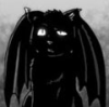
Not that bad. Remember - Practice makes perfect. If you stick at it, try some stuff without frankensteining, or at least use frankensteining to get the shape and proportions right, and then paint over it, you will get better. I guarantee it.
That said, there are a couple of things left to do on this sprite:
- The telescope needs definition. As in a better outline, and more highlights. Having it all be one or two crammed together colors doesn't work.
- More than purple. A different head (maybe a bearded one?), a different pose (just raise or lower the arm, or something) would do a lot. I would actually suggest a red mage based sprite, because it seems more astronomer- ish.
- Less of purple. Purple was an extremely expensive color. I doubt one mage could afford a huge purple cloak. Try grey.
- Shading for the telescope. The lense is all one color. Not good.
Now, I have no idea what "Graphics Gale Free Edition" is, but The GIMP is a nice free tool. If you have a mac, I suggest Pixen, which is also free.
Some cool tutorials are here: http://www.spriteart.com/pixeltutorial.html Not wesnoth style, but informative and good nonetheless.

Instead of flaring out at the end, to make the bottom end appear larger like the lines of a telescope, but in a cylindrical fashion, I would suggest taking the two pixels on either end of that bottom line and moving them in one space respectively, bringing them in line with the pixels above them.
This should give you more of a telescope shape that you're looking for, but Urs comment about outline and some highlights will make that effect far better.
This should give you more of a telescope shape that you're looking for, but Urs comment about outline and some highlights will make that effect far better.
Mainline Maintainer: AOI, DM, NR, TB and THoT.
UMC Maintainer: Forward They Cried, A Few Logs, A Few More Logs, Start of the War, and Battle Against Time
UMC Maintainer: Forward They Cried, A Few Logs, A Few More Logs, Start of the War, and Battle Against Time
Thanks a lot for the advice. As I said, these are my first real edits to sprites, so all that was really helpful. I read through those tutorials, so hopefully my shading at least has improved.
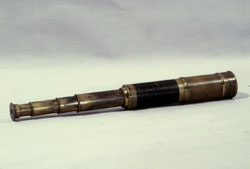
I've based it off the red mage as Urs suggested, given him a beard (not sure how well that went) and done two versions: One where he holds the telescope, one when its attached to his belt. I've included the telescope on its own there too, so its clear what it looks like otherwise.
I'm having trouble reposition ing the arm - it doesn't seem to look good. Any tips?
Edit: I'll recolour them later.
- Attachments
-
- Xerimec 2 holding telescope.png (2.04 KiB) Viewed 4600 times
-
- Xerimec 2 not holding telescope.png (2.09 KiB) Viewed 4601 times
-
thespaceinvader

- Retired Art Director
- Posts: 8414
- Joined: August 25th, 2007, 10:12 am
- Location: Oxford, UK
- Contact:
It's a bit neon =P
That aside though, it looks a lot more telescope-like than before.
But you're right, the beard hasn't worked so well. At the moment it looks a bit low down and a bit plastic - like he's wearing a fake one rather than growing a real one. Can i suggest you take a look at some of the dwarf sprites to see how to do beards - maybe even frankenstein one on and recolour it.
http://thespaceinvader.co.uk | http://thespaceinvader.deviantart.com
Back to work. Current projects: Catching up on commits. Picking Meridia back up. Sprite animations, many and varied.
Back to work. Current projects: Catching up on commits. Picking Meridia back up. Sprite animations, many and varied.
-
BloodIssyl
- Posts: 152
- Joined: March 21st, 2006, 10:25 pm
-
thespaceinvader
- Retired Art Director
- Posts: 8414
- Joined: August 25th, 2007, 10:12 am
- Location: Oxford, UK
- Contact:
Again, looking at examples is good. It's currently a bright yellowish green colour, very uniform. Check out some sprites with the appropriate colours (the Halberdier has some brassy/goldy bits, from memory) to see how those colours appear in game.
http://thespaceinvader.co.uk | http://thespaceinvader.deviantart.com
Back to work. Current projects: Catching up on commits. Picking Meridia back up. Sprite animations, many and varied.
Back to work. Current projects: Catching up on commits. Picking Meridia back up. Sprite animations, many and varied.
I am with thespaceinvader, not only are telescopes more of a brassy color, that color will form a nice contrast with his clothes and make the telescope stand out more.
Also, I would stick with the one where he is holding it, the impression that he is about to put it to his eye further cements the view that it is a telescope.
Also, I would stick with the one where he is holding it, the impression that he is about to put it to his eye further cements the view that it is a telescope.
Mainline Maintainer: AOI, DM, NR, TB and THoT.
UMC Maintainer: Forward They Cried, A Few Logs, A Few More Logs, Start of the War, and Battle Against Time
UMC Maintainer: Forward They Cried, A Few Logs, A Few More Logs, Start of the War, and Battle Against Time
Thanks again for the comments. I've edited the beard to use more of the techniques used (as far as I could tell) to make the dwarven ones, and created a large mustache to make it look less fake. The telescope's colours have been changed to the halbadier's brassy ones, and I tried to makes the shadows less uniform.
With the detail work approaching finish (the latest suggestions have had a great effect, I think) I'm thinking of changing the colour of his cloak to differentiate him from the normal red mage more at a glance.
With the detail work approaching finish (the latest suggestions have had a great effect, I think) I'm thinking of changing the colour of his cloak to differentiate him from the normal red mage more at a glance.
- Attachments
-
- Updated
- Xerimec 2 holding telescope.png (2.1 KiB) Viewed 4485 times
-
thespaceinvader
- Retired Art Director
- Posts: 8414
- Joined: August 25th, 2007, 10:12 am
- Location: Oxford, UK
- Contact:
The eyes don't look level o_O
And the lighting direction on the telescope is not consistent - it apppears to be lit from the side, while the rest of the image is lit from above. I think it's cos the shading's deeper on the top than on the bottom. The beard looks better, but it still doesn't look quite right somehow.
And the lighting direction on the telescope is not consistent - it apppears to be lit from the side, while the rest of the image is lit from above. I think it's cos the shading's deeper on the top than on the bottom. The beard looks better, but it still doesn't look quite right somehow.
http://thespaceinvader.co.uk | http://thespaceinvader.deviantart.com
Back to work. Current projects: Catching up on commits. Picking Meridia back up. Sprite animations, many and varied.
Back to work. Current projects: Catching up on commits. Picking Meridia back up. Sprite animations, many and varied.
Trickier to tell now, but I can kinda see what you mean. I was aiming for lighting to come from the top left, but now I see you're right, its coming from above. Here's the new edit, I changed the beard a bit too, but I'm not sure exactly what's wrong, so its hard to fix it.
It looks to me like he's looking off to our right and his left eye is obscured by his nose. I've tried shifting it a pixel or two, but it ends up just looking awful.
It looks to me like he's looking off to our right and his left eye is obscured by his nose. I've tried shifting it a pixel or two, but it ends up just looking awful.
- Attachments
-
- Edited beard + telescope shading.
- Xerimec 2 holding telescope.png (2.1 KiB) Viewed 4469 times

-
thespaceinvader
- Retired Art Director
- Posts: 8414
- Joined: August 25th, 2007, 10:12 am
- Location: Oxford, UK
- Contact:
Looks much better. The final slight niggle is the hard-edged shadow from the telescope. Put a bit of gaussian blur on it, and you're there =)
http://thespaceinvader.co.uk | http://thespaceinvader.deviantart.com
Back to work. Current projects: Catching up on commits. Picking Meridia back up. Sprite animations, many and varied.
Back to work. Current projects: Catching up on commits. Picking Meridia back up. Sprite animations, many and varied.