Loyalist Portrait Series
Moderator: Forum Moderators
Re: Loyalist Portrait Series
Great work so far LordBob!LordBob wrote:I'm also posting a rough of the halberdier for a check of the pose and proportions. Next step will see the linework cleaned.
To me it seems like the Halberdier is cowering, because he is afraid of something. Like he sees a huge dragon in front of him and suddenly feels very small.
I don't know if what I see is real or not, but it's something to think about. And the lighting/coloring might fix it anyway.

Re: Loyalist Portrait Series
deserter wrote:To me it seems like the Halberdier is cowering, because he is afraid of something. Like he sees a huge dragon in front of him and suddenly feels very small. I don't know if what I see is real or not, but it's something to think about. And the lighting/coloring might fix it anyway.
Mainline Maintainer: AOI, DM, NR, TB and THoT.
UMC Maintainer: Forward They Cried, A Few Logs, A Few More Logs, Start of the War, and Battle Against Time
UMC Maintainer: Forward They Cried, A Few Logs, A Few More Logs, Start of the War, and Battle Against Time
-
LordBob

- Portrait Director
- Posts: 1309
- Joined: December 8th, 2008, 8:18 pm
- Location: Lille, France
- Contact:
Re: Loyalist Portrait Series
I'll keep that in mind when inking, posture is important and can change a lot with just a few lines.
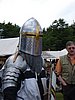
Meanwhile, WIP of the pikeman. I finally changed his helm, but I'm not completely happy with the result. Maybe with a larger neck cover ?
Meanwhile, WIP of the pikeman. I finally changed his helm, but I'm not completely happy with the result. Maybe with a larger neck cover ?
- Attachments
-
Want to see more of my art ? Visit my portfolio !
-
beetlenaut

- Developer
- Posts: 2825
- Joined: December 8th, 2007, 3:21 am
- Location: Washington State
- Contact:
Re: Loyalist Portrait Series
I may be in the minority, but I liked the other helm, even though it doesn't quite match the sprite. The main impression I always got out of the helmet on the sprite is "pointy", which the other one was. I point it out just to let you know that not everybody disapproved of the last one.
(That's a wicked looking weapon! Pity the guy on the other side of it.)
(That's a wicked looking weapon! Pity the guy on the other side of it.)
Campaigns: Dead Water,
The Founding of Borstep,
Secrets of the Ancients,
and WML Guide
The Founding of Borstep,
Secrets of the Ancients,
and WML Guide
Re: Loyalist Portrait Series
me too.beetlenaut wrote:I liked the other helm
This new helmet looks to heavy and doesn't match the over all look , imho.
The rest of his armour is quite light weight. Why should he need a helmet that limits his view that much?
I don't see any problems with an elf-woman hitting somebody with a mace...
-
thespaceinvader

- Retired Art Director
- Posts: 8414
- Joined: August 25th, 2007, 10:12 am
- Location: Oxford, UK
- Contact:
Re: Loyalist Portrait Series
I looks like you're not in the minority, beetlenaut. I preferred the other one as well. I liked to see his face. Especially as this one just makes me think 'Robocop'...
I look forward top seeing the finished version =)
I look forward top seeing the finished version =)
http://thespaceinvader.co.uk | http://thespaceinvader.deviantart.com
Back to work. Current projects: Catching up on commits. Picking Meridia back up. Sprite animations, many and varied.
Back to work. Current projects: Catching up on commits. Picking Meridia back up. Sprite animations, many and varied.
-
Lord.Bedham
- Posts: 49
- Joined: February 4th, 2008, 12:56 pm
- Location: Germany
Re: Loyalist Portrait Series
Wow The Armor look good es Allways!
And about the Helm, I Dont like the Oldone, But The Sallet is not so good for the pikeman.
It looks Awsome on the Head of the Hellebardier.
you should better take one of the Kattle hats i post.
But its your choice, i dont want to give commands to anyone here. Because an Artist need his freedome.
Do that wath you think, is the best for the sprite Lord Bob, i think you know wath you are doing.
Schaller or Sallets look better on Heavy Armor.

I gonna club you in`da face
-
hyperactivething

- Posts: 45
- Joined: December 8th, 2007, 5:35 pm
- Location: Santiago, Chile
Re: Loyalist Portrait Series
The other one made me think 'Hershey Kisses' hahathespaceinvader wrote:Especially as this one just makes me think 'Robocop'...
I do prefer the second one though. Now that TSI mentions it, it does remind me of Robocop. But it doesn't bother me. In my opinion (and I know nothing about medieval armor), the first helmet looked too ceremonial, not really functional..
Girl, you thought he was a man, but he was a muffin!
-
Kestenvarn

- Inactive Developer
- Posts: 1307
- Joined: August 19th, 2005, 7:30 pm
- Contact:
Re: Loyalist Portrait Series
I happen to like the new sallet, at least.
Re: Loyalist Portrait Series
imho, it's not only the helmet. It's also his cloth and armour that look ceremonical. That's why I think the first helmet matches at least better. I think it's ok that it looks a bit ceremonical, specially on this unithyperactivething wrote:the first helmet looked too ceremonial, not really functional..
I don't see any problems with an elf-woman hitting somebody with a mace...
Re: Loyalist Portrait Series
I cannot longer hold me off:
You are doing a fantastic job MyLord (Bob)!!
Your unique unit portraits, will form the loyalist to the coolest faction to play. Although I play only the loyalists anyway, it will be much more fun to play with them and enjoy the dashing portraits. I can't wait to have them all in the game.
Both thumbs up and keep it up!
"Wenn der Bauer im Strudel mäht und die Wolken schwer zu Tale höngen, dann brauch auch du nicht lang, Mariechen, zu deinem Pferdchen kümmen."
- Vermutlich von C. Morgenstern
- Vermutlich von C. Morgenstern
-
LordBob
- Portrait Director
- Posts: 1309
- Joined: December 8th, 2008, 8:18 pm
- Location: Lille, France
- Contact:
Re: Loyalist Portrait Series
Pipeman (and every other person who, at some time, posted their appreciation): you're welcome ! I can't express how much I'm pleased to be able to post my art where it can be useful, not to mention how interesting working on an entire series of portraits can prove.
Lord.Bedham: while good-looking, the Kettle hats are pretty similar to the helmet of the swordsman. I wish to keep them different
Anyone not liking the new hat: go to the place of a thousand torments, you Infidels !
...To be honest, I'm not pleased with either design, so I'll be toying some more with the hat. Here's a first attempt, tell me what you think of it.
I also made a very quick and very dirty job of shading the studs so that you see the whole armour. Several among you mentionned it looks ceremonial, so I'd like to know what makes you feel that way - that ceremonial bit wasn't intended, I'll change it if I can
- Attachments
-
Want to see more of my art ? Visit my portfolio !

Re: Loyalist Portrait Series
the longer halberd really looks classy!
regarding the helmet i have to confess that i still like the simple very first version the best... this one doesn't look really balanced. is the shading of the cloth finished or preliminary?
otherwise, good job, as always!
regarding the helmet i have to confess that i still like the simple very first version the best... this one doesn't look really balanced. is the shading of the cloth finished or preliminary?
otherwise, good job, as always!
Re: Loyalist Portrait Series
At first - The ceremonial look:
I think the prime reason are the combined armour types; plate on brigantine. Particularly your brigantine looks quite noble. Not like an practical piece of armour from an ordinary footman. Keeping it in a more dirty and battered look and natural colours, maybe light brown, or grimy white, could solve this "ambiguity".
Second - The helmet:
A kettle hat would match with the sprite perfectly. I like the one that Lord.Beham had posted very much:

Form the top more pointy and it would be up with the sprite and - so I think - it will look very stylish, too. Maybe you try it and whe wait for the response.
Please say me LordBob: What program do you use for these masterpieces? And how do you start with your portraits? Hand drawn sketches?
I think the prime reason are the combined armour types; plate on brigantine. Particularly your brigantine looks quite noble. Not like an practical piece of armour from an ordinary footman. Keeping it in a more dirty and battered look and natural colours, maybe light brown, or grimy white, could solve this "ambiguity".
Second - The helmet:
A kettle hat would match with the sprite perfectly. I like the one that Lord.Beham had posted very much:
Form the top more pointy and it would be up with the sprite and - so I think - it will look very stylish, too. Maybe you try it and whe wait for the response.
Please say me LordBob: What program do you use for these masterpieces? And how do you start with your portraits? Hand drawn sketches?
"Wenn der Bauer im Strudel mäht und die Wolken schwer zu Tale höngen, dann brauch auch du nicht lang, Mariechen, zu deinem Pferdchen kümmen."
- Vermutlich von C. Morgenstern
- Vermutlich von C. Morgenstern
-
Lord.Bedham
- Posts: 49
- Joined: February 4th, 2008, 12:56 pm
- Location: Germany
Re: Loyalist Portrait Series
Hmm, i take back wath i said about :
""Do that wath you think, is the best for the sprite Lord Bob, i think you know wath you are doing.""
This Helm so not wath i expectet. You said you want to make them Different, that good. But why this strong difference between the Swordsman ? The Helm of the sprite is Simular, and thay are Both lvl 2 units.
So why dont you make little differences. The body Armor look already Awsome and so diverse.
So you coult just take one of the Kattlehats. Like me and Pipeman said. I want you to take this Helm to like Pipeman choose. And there are Differenses:

I know you reedone this 2 times and you are going to be angry about it, but i think THIS would be the Best for the sprite.
I gonna club you in`da face