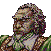
Loyalist Portrait Series
Moderator: Forum Moderators
-
Skizzaltix
- Posts: 1114
- Joined: December 9th, 2005, 2:38 am
Re: Loyalist Portrait Series
Actually, Bamboo Fun doesn't, and neither does Graphire 
Bamboo is like the Fun only less Fun, so it doesn't either.
Great job! I seriously love that hair texture
Though, I think it's just my imagination, but for some reason his right upper-arm appears to be extremely long... possibly caused by my misreading the armor sleeve?
Bamboo is like the Fun only less Fun, so it doesn't either.
Great job! I seriously love that hair texture
Though, I think it's just my imagination, but for some reason his right upper-arm appears to be extremely long... possibly caused by my misreading the armor sleeve?
Re: Loyalist Portrait Series
Yes it does. I have one and I made sure that it did before I posted... I would not go off of random things that I might'of found on the internet
-
thespaceinvader

- Retired Art Director
- Posts: 8414
- Joined: August 25th, 2007, 10:12 am
- Location: Oxford, UK
- Contact:
Re: Loyalist Portrait Series
Graphire can't either - it does pressure, but not tilt.
http://thespaceinvader.co.uk | http://thespaceinvader.deviantart.com
Back to work. Current projects: Catching up on commits. Picking Meridia back up. Sprite animations, many and varied.
Back to work. Current projects: Catching up on commits. Picking Meridia back up. Sprite animations, many and varied.
-
LordBob

- Portrait Director
- Posts: 1309
- Joined: December 8th, 2008, 8:18 pm
- Location: Lille, France
- Contact:
Re: Loyalist Portrait Series
I wasn't thinking of the "tilt" control (Never could get the hang of this one myself...Advice welcome  ). What I'm refering to is :
a) Setting the "angle jitter" control on "direction" in CS3. Photoshop detects the direction of your stroke and automatically sets a brush angle perpendicular to the stroke
b) This pen automatically detects the angle of its tip and applies it to your brush
 I swear, some day I'm gonna get one...
a) Setting the "angle jitter" control on "direction" in CS3. Photoshop detects the direction of your stroke and automatically sets a brush angle perpendicular to the stroke
b) This pen automatically detects the angle of its tip and applies it to your brush
Last edited by LordBob on April 28th, 2009, 6:58 pm, edited 2 times in total.
Want to see more of my art ? Visit my portfolio !
-
Skizzaltix
- Posts: 1114
- Joined: December 9th, 2005, 2:38 am
Re: Loyalist Portrait Series
I have a Bamboo Fun, and it doesn't do tilt. If we're in any doubt, go check Wacom's product overview--pen angle isn't in the list of features
The Bamboo Fun (and no doubt the Graphire) almost gives the illusion of having angle detection, because if you hold the pen closer to parallel with the tablet, you can't exert as much pressure on the nib, so your lines are smaller, but there's nothing in there that's detecting pressure around the sides of the nib; just on the tip.
@LordBob: well... the Bamboo Fun doesn't do that, either
-
thespaceinvader
- Retired Art Director
- Posts: 8414
- Joined: August 25th, 2007, 10:12 am
- Location: Oxford, UK
- Contact:
Re: Loyalist Portrait Series
Bob - that's not a function of the pen, it's a function of the tablet. You could use that pen on any tablet, i think, but it would only have tilt sensitivity on an intuos or better.
And yeah, i need to figure something like that out on GIMP - it lacks distinctly in (easy) texturing techniques.
And yeah, i need to figure something like that out on GIMP - it lacks distinctly in (easy) texturing techniques.
http://thespaceinvader.co.uk | http://thespaceinvader.deviantart.com
Back to work. Current projects: Catching up on commits. Picking Meridia back up. Sprite animations, many and varied.
Back to work. Current projects: Catching up on commits. Picking Meridia back up. Sprite animations, many and varied.
-
LordBob
- Portrait Director
- Posts: 1309
- Joined: December 8th, 2008, 8:18 pm
- Location: Lille, France
- Contact:
Re: Loyalist Portrait Series
Finished the horseman's shading
- Attachments
-
-
- human-horseman_small.png (47.76 KiB) Viewed 5018 times
Want to see more of my art ? Visit my portfolio !
-
Flameslash

- Posts: 633
- Joined: December 21st, 2008, 12:29 pm
Re: Loyalist Portrait Series
I think the nearer arm looks funny. The light part just flicks to dark.
-
thespaceinvader
- Retired Art Director
- Posts: 8414
- Joined: August 25th, 2007, 10:12 am
- Location: Oxford, UK
- Contact:
Re: Loyalist Portrait Series
Is nice =D
But i think the peak of his helmet ought to cast a shadow onto his face. And perhaps the shadows on his face are a little too dark...
But i think the peak of his helmet ought to cast a shadow onto his face. And perhaps the shadows on his face are a little too dark...
http://thespaceinvader.co.uk | http://thespaceinvader.deviantart.com
Back to work. Current projects: Catching up on commits. Picking Meridia back up. Sprite animations, many and varied.
Back to work. Current projects: Catching up on commits. Picking Meridia back up. Sprite animations, many and varied.
-
Thrawn

- Moderator Emeritus
- Posts: 2047
- Joined: June 2nd, 2005, 11:37 am
- Location: bridge of SSD Chimera
Re: Loyalist Portrait Series
almost as if the guy was holding something long and straight in that hand....Flameslash wrote:I think the nearer arm looks funny. The light part just flicks to dark.
...please remember that "IT'S" ALWAYS MEANS "IT IS" and "ITS" IS WHAT YOU USE TO INDICATE POSSESSION BY "IT".--scott
this goes for they're/their/there as well
this goes for they're/their/there as well
Re: Loyalist Portrait Series
I agree with the notion that the peak of his helmet should in real life cast the shadow onto his face - at least should partially obscure the forehead. If you go for photorealism, the sifde of his nose should also be lighted by the reflection of the inner surface ot helmet's cheek plate. But it would be too much IMO. It's just an illustration, with contour lines and simplified shading. I like the picture in this state, it gives a good impression, which covers the minor imperfections. And the horse is wonderful, especially the texture on his neck.thespaceinvader wrote:Is nice =D
But i think the peak of his helmet ought to cast a shadow onto his face. And perhaps the shadows on his face are a little too dark...
-
Cloud
- Art Contributor
- Posts: 502
- Joined: December 17th, 2008, 7:43 pm
- Location: The land of pixels
- Contact:
Re: Loyalist Portrait Series
Brilliant work on the horse, something bugs me about the rider, particularly the armour. To me it doesn't quite feel connected. I wish I could elaborate more to help, but it's just a gut feeling. I'm no artist and I'm probably wrong so feel free to totally ignore the crit  (Just throwing it up in the air for someone to take pot-shots at)
That aside, very very nice work
That aside, very very nice work
Softly/SoftlySplinter on IRC. Will be lurking around more these days
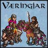
Mainline Animations|The Væringjar
Art for these mead-sodden, bearded mushroom-junkies by Girgistian!
Mainline Animations|The Væringjar
Art for these mead-sodden, bearded mushroom-junkies by Girgistian!

Re: Loyalist Portrait Series
Woha - nice work! I'll join the chorus of praising the horse's shading!
Apart from the already mentioned missing cast shadow on his face, the only nitpick I have is that he is severly cross-eyed.
And for your use of textured brushes - do you use only the ones that already come with photoshop, like the Dry Media / Wet Media / Faux you mentioned? I've started collecting various brushes from various sources or am doing my own ones, since I never got the hang of those.

Re: Loyalist Portrait Series
Here's a few issue that my non-artist eye picks up:
red lines: the shading here follows unbroken contours, yet the armor is layered and is at different levels.
green line: my eye cannot understand why this area is light, especially with the surrounding areas are so dark.
purple line: if the image is backlit and the top of the horses head is as bright as it is all the way around I would expect the light to also at least reach this line.
edit: sorry for the artifacts of having to use paint to edit.
- Attachments
-
-
Kestenvarn

- Inactive Developer
- Posts: 1307
- Joined: August 19th, 2005, 7:30 pm
- Contact:
Re: Loyalist Portrait Series
horse muscleJW wrote:green line: my eye cannot understand why this area is light, especially with the surrounding areas are so dark.
right?